

What generated prototypes get wrong
Prompt-driven tools are very good at producing screens that look right and run. They are weaker at the things users feel: what happens when data is missing, what the error says, whether the flow makes sense across a whole task. The result demos well and frustrates in real use.
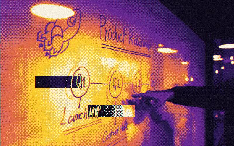
The 30-day plan
Understand and fix the core
Interview or observe five users. Map the main flow. Simplify it and remove anything that blocks it.
Cover the states
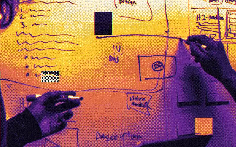
Design loading, empty, error, success, and permission states for each key screen.
Make it consistent
Unify type, color, spacing, and components. Create a small set of reusable patterns.
Test and ship
Run a usability test, fix the top issues, check accessibility basics, and launch to a first group.
Audit before you change
- Click through every screen as a new user and note every moment of doubt.
- List screens with no empty, loading, or error state.
- Look for inconsistent buttons, labels, and spacing.
- Check the flow on a phone.
- Note where a user can get stuck with no way out.
Rank the findings by impact on the core flow. Fix the top ten, not the top hundred.
Keep the code, change the experience
You rarely need to start over. The aim is to restructure information, clarify flows, and standardize the interface. A designer working with an engineer can improve a prototype step by step, while it keeps running.
Know when to stop
At day thirty you want a product that a new user can understand and complete the core job in, and that does not embarrass you. It does not need to be perfect. Ship, measure, and keep improving in small cycles.