Make the first step obvious
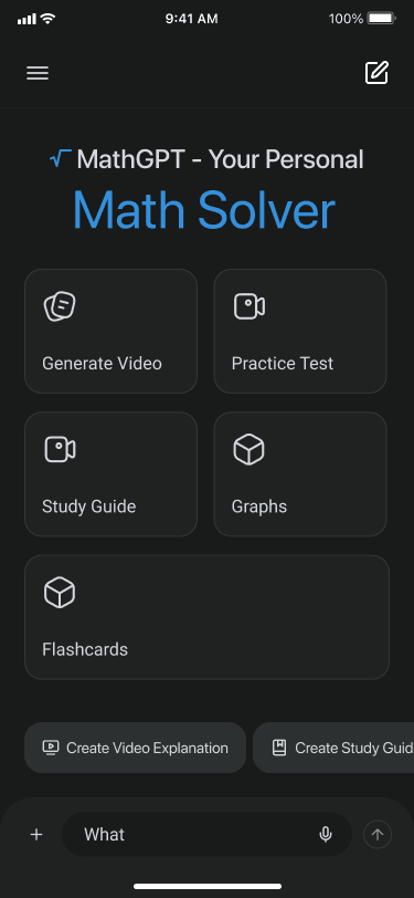
Students should type, speak, or upload a problem without stopping to learn the interface.
MathGPT asked us to reimagine their AI math tutor. We designed a full concept, end to end, and proposed it to their team. It never shipped, but it's a clear look at how we approach a hard, feature-dense product problem.
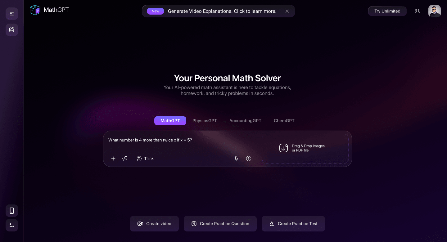
An AI math tool can produce an answer in seconds. The harder part is helping a student understand what happened, practice the idea, and come back to it later.
MathGPT had a lot to fit into one product: chat, video explanations, study guides, graphs, flashcards, practice tests, classes. All without turning into a crowded dashboard.
Students should type, speak, or upload a problem without stopping to learn the interface.
Every explanation should lead naturally into practice, revision, and a saved class context.
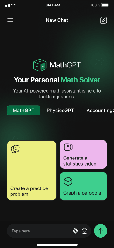
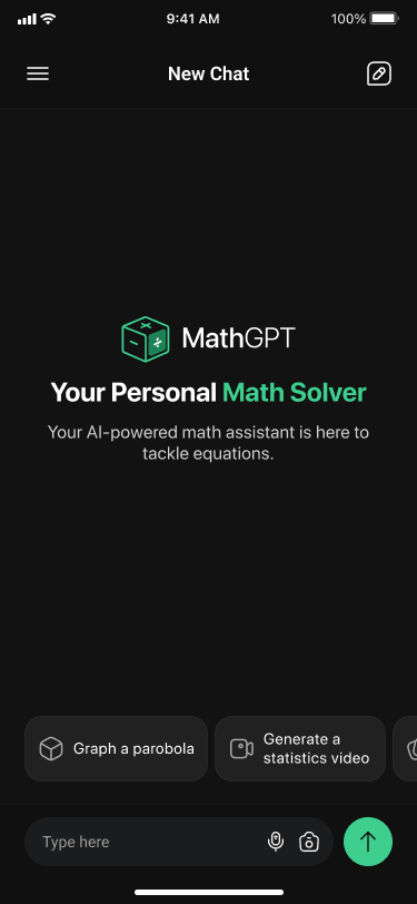
The core experience had to stay focused and useful on a much smaller mobile screen.
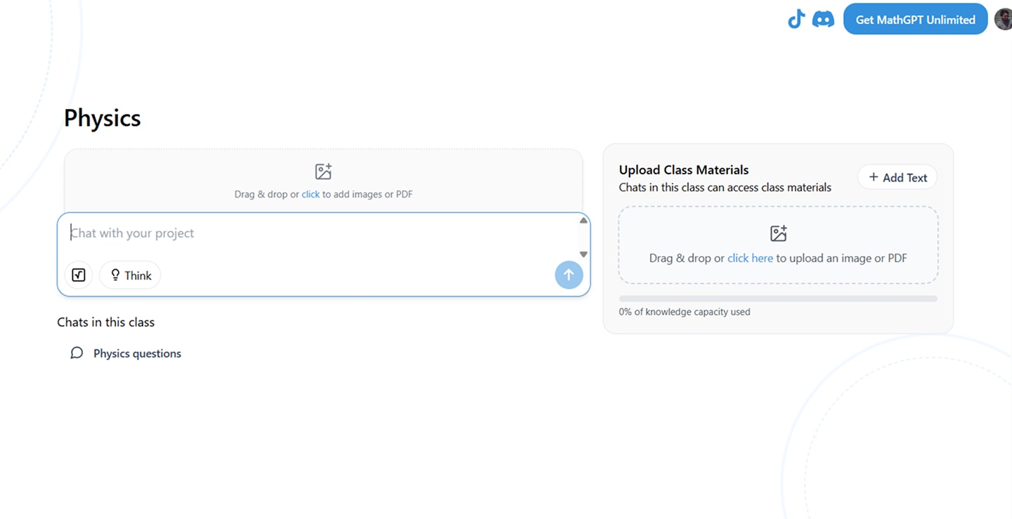
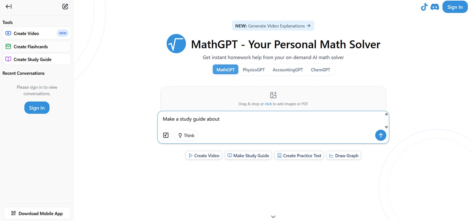
The prompt sits at the center. Every other tool is arranged around the work a student is already doing.
We kept the current question in focus while classes, recent activity, and learning formats stayed one click away. A dark, low-distraction canvas gave the content room to breathe.
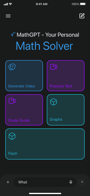
Each format, video, practice, study, graphs, flashcards, got its own color. That was the wayfinding, so we didn't need more menus.
Uploaded material, the student’s request, the generated explanation, and the next prompt all stay visible in one continuous workspace.

Every version tightened the layout and sharpened the visual system, until the interface matched how a student actually studies.
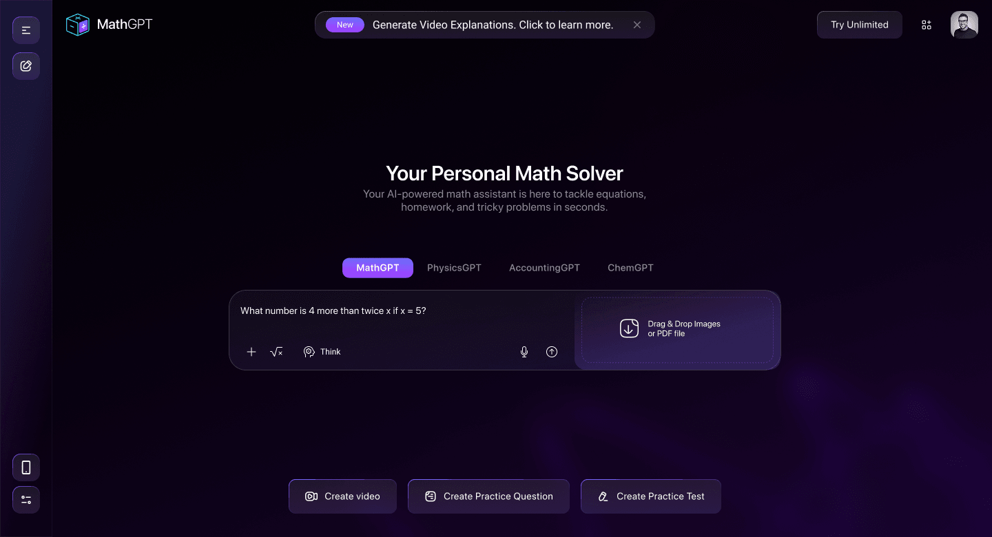
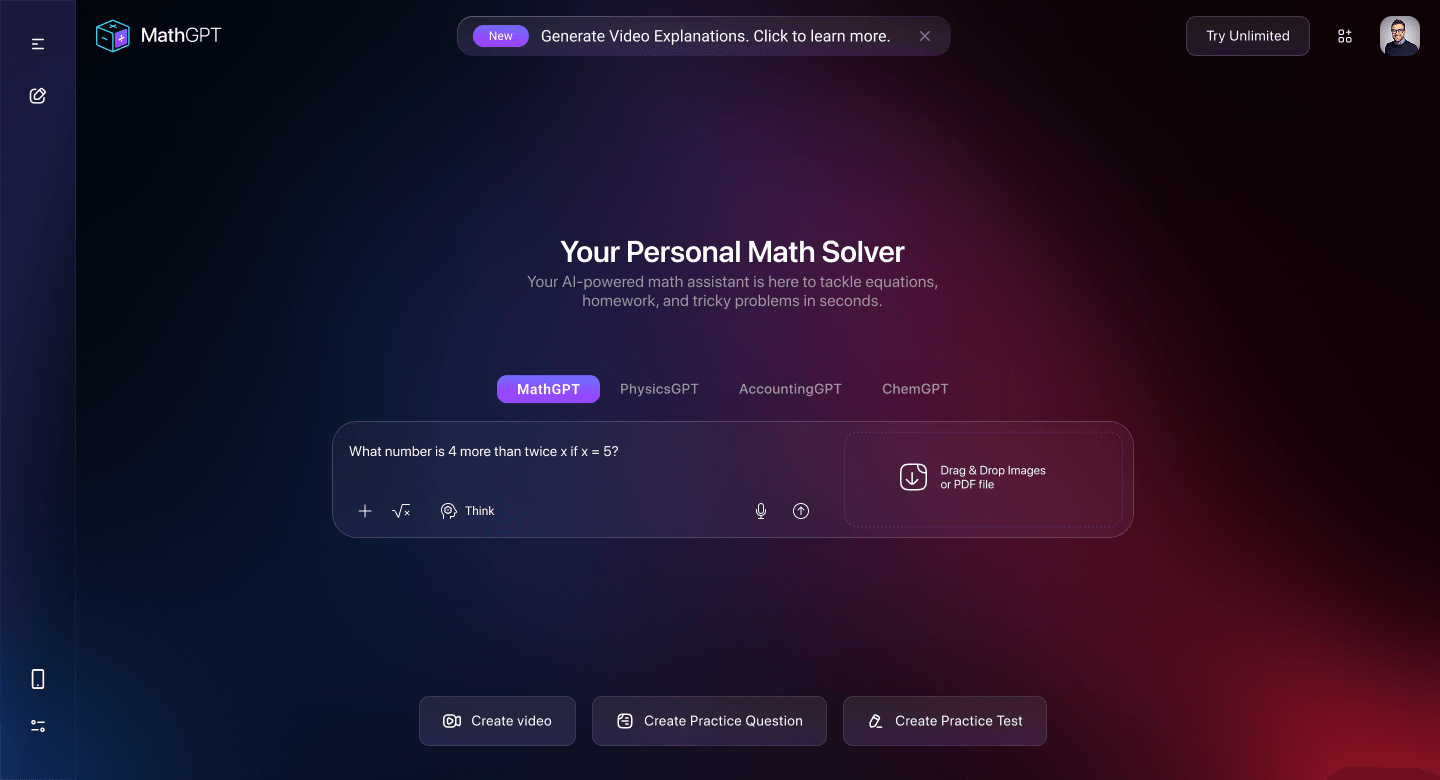
Video explanations, class organization, and the surrounding UI shell all share the same patterns, so nothing feels like a bolted-on feature.
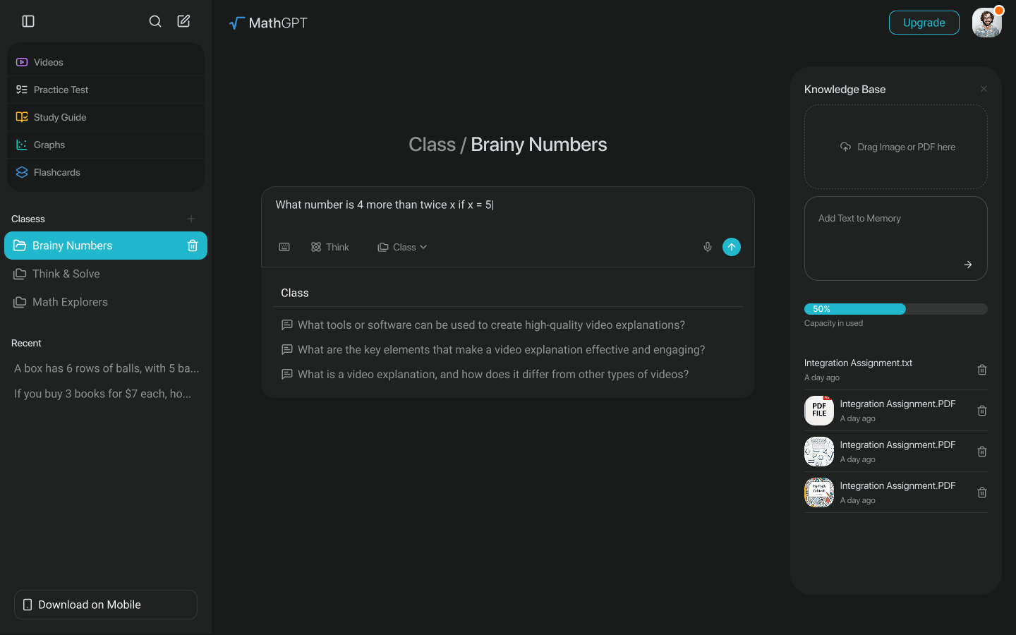

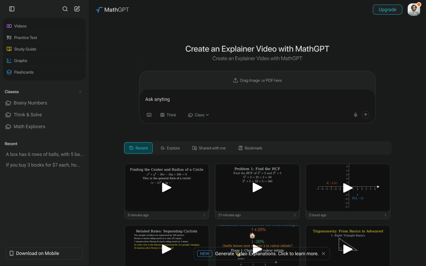
We delivered a complete design concept, from the core workspace to mobile, and proposed it to the MathGPT team as a direction for the product’s next stage.
MathGPT hasn’t moved this design into production. We’re sharing it here because it’s a clear example of how we approach a hard, feature-dense product problem, not a claim about what MathGPT users see today.
Questions, explanations, practice, study material, and classes were all designed as part of the same screen.
Clear prompts, familiar controls, and an obvious next step, so a student could just start.
The desktop workspace and the mobile app were designed on the same patterns, so nothing would feel like a different product.
Building an AI product people have to trust?
Bring the model and the messy first build. We'll help you find the right place to start.