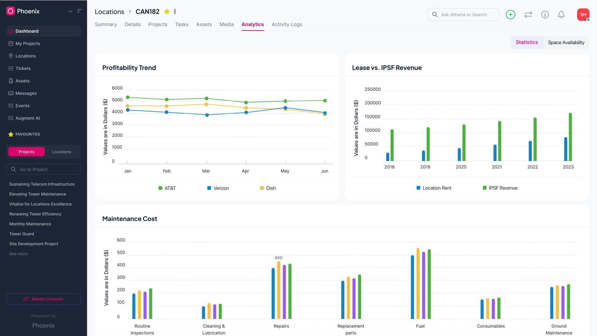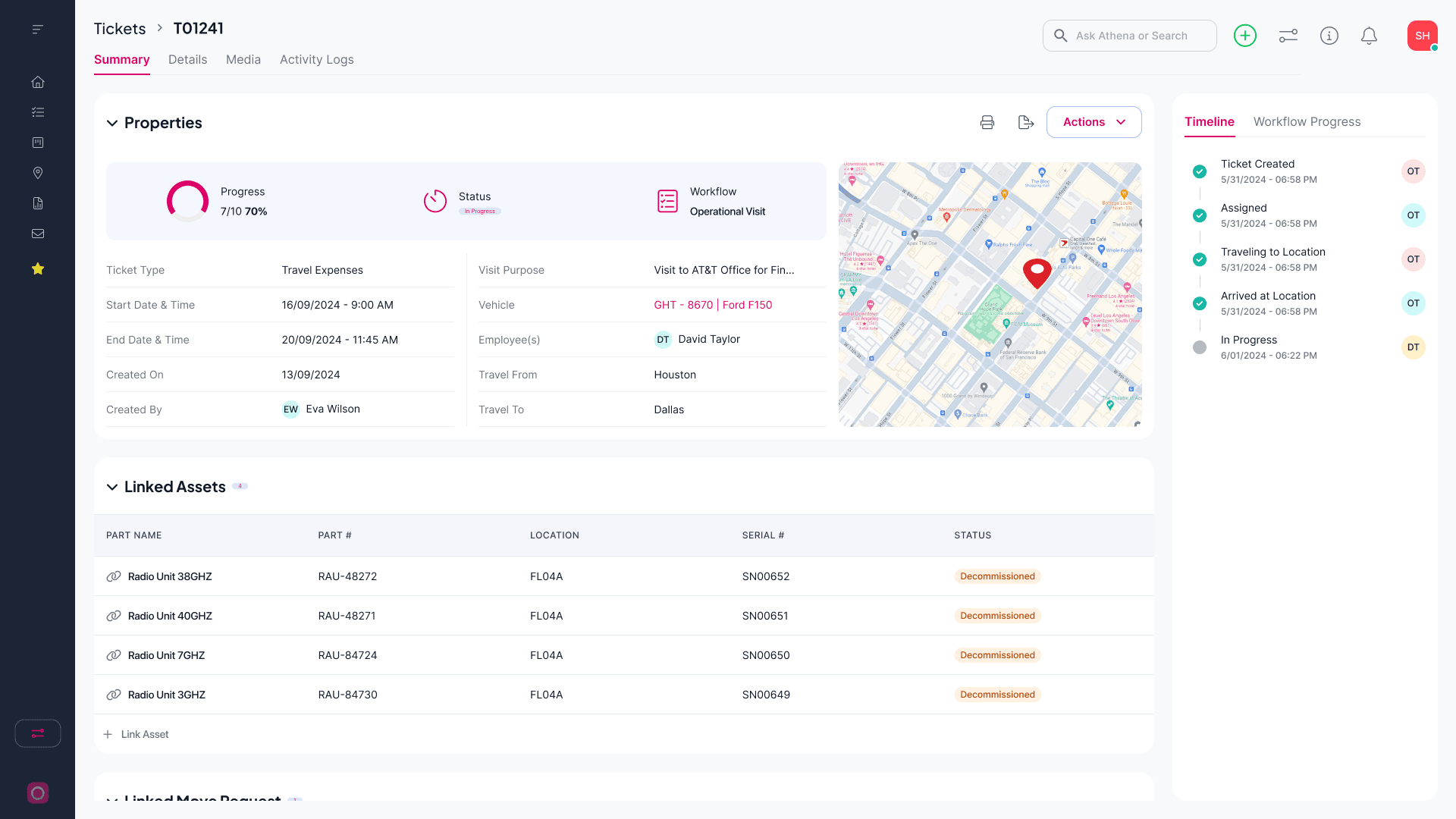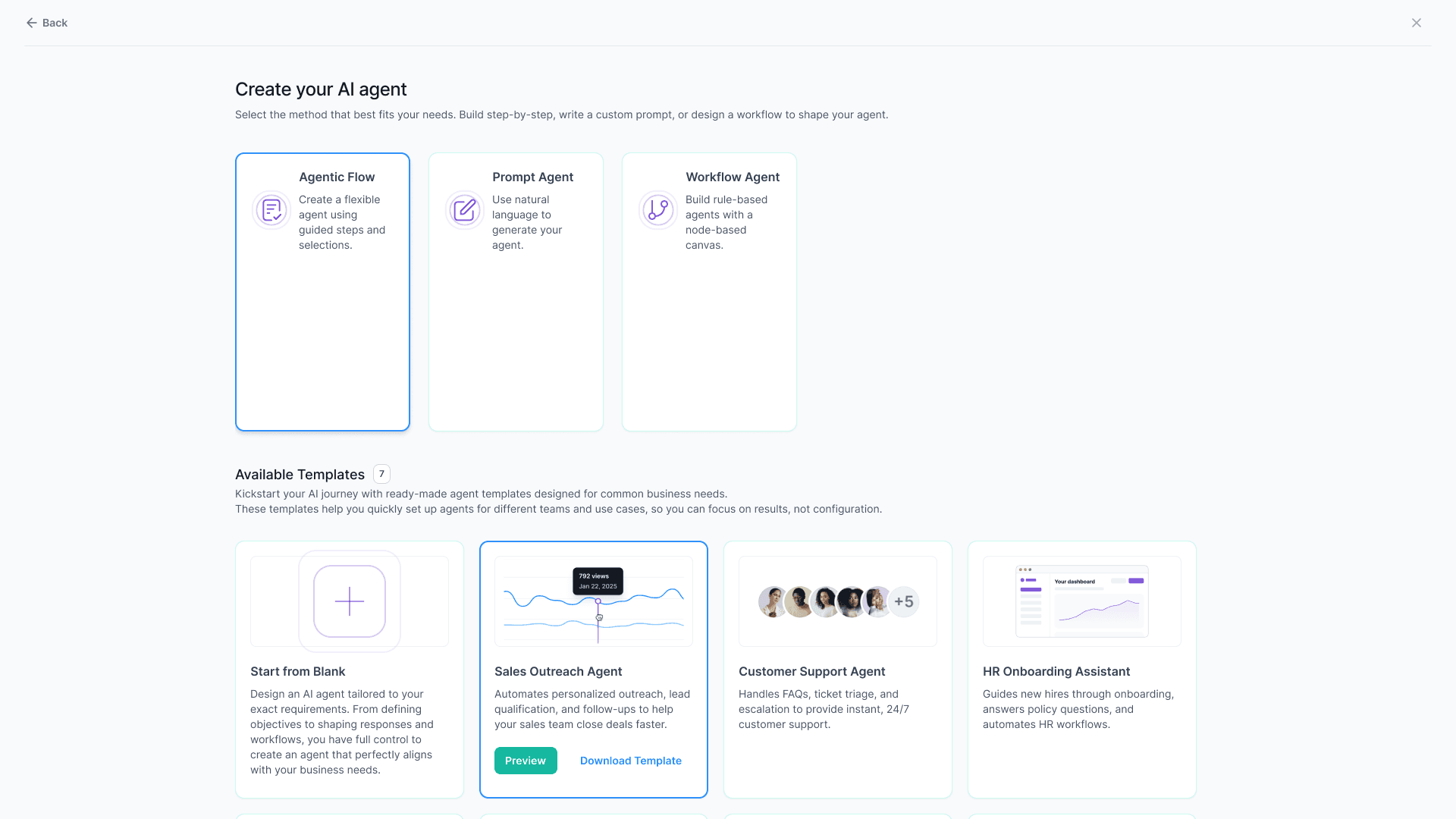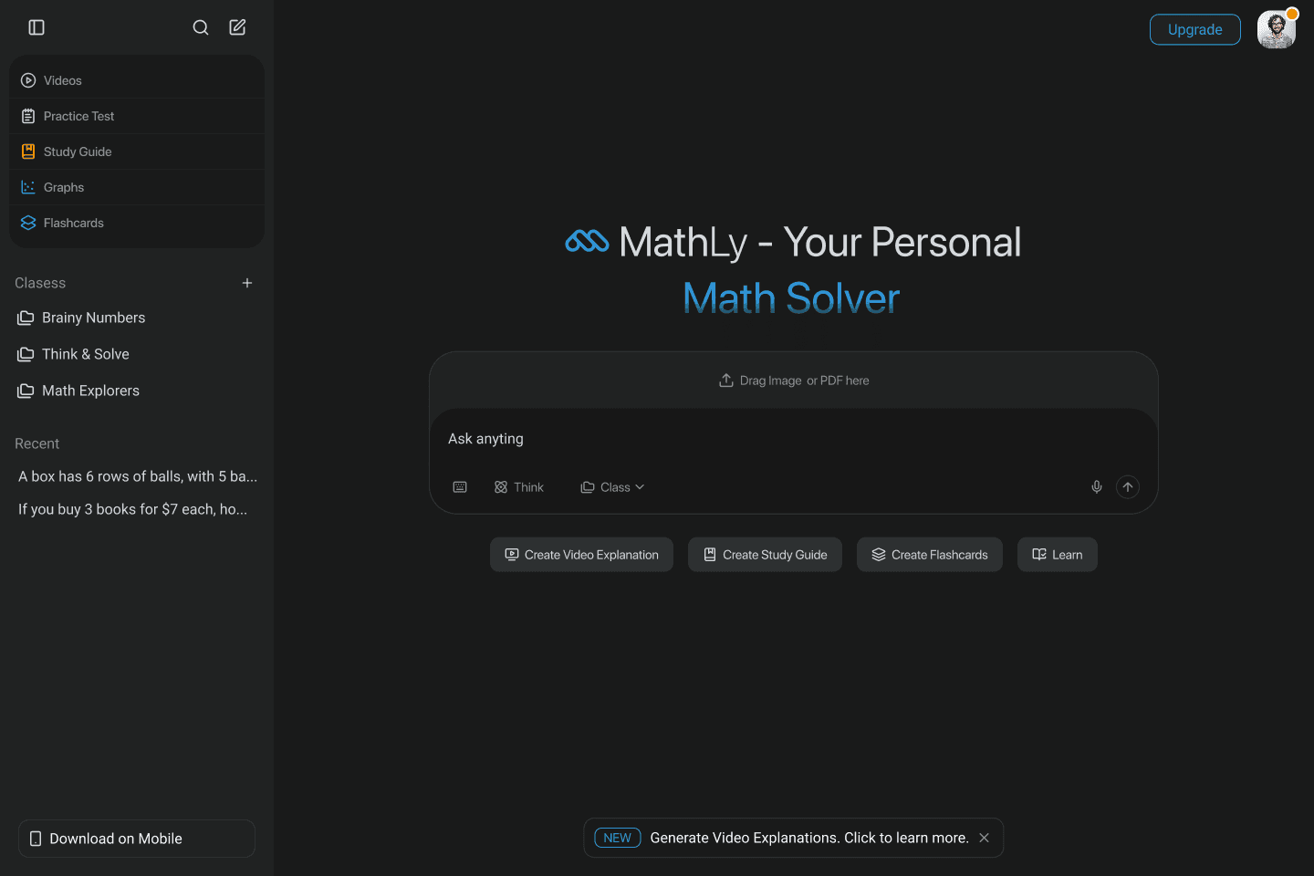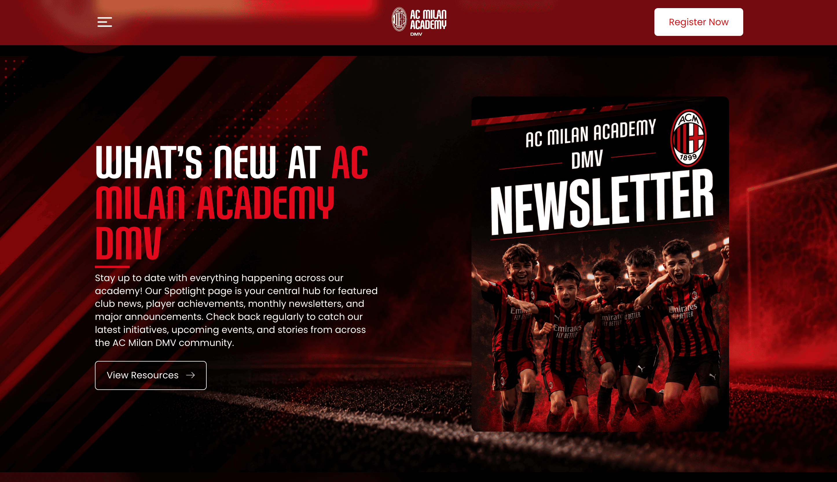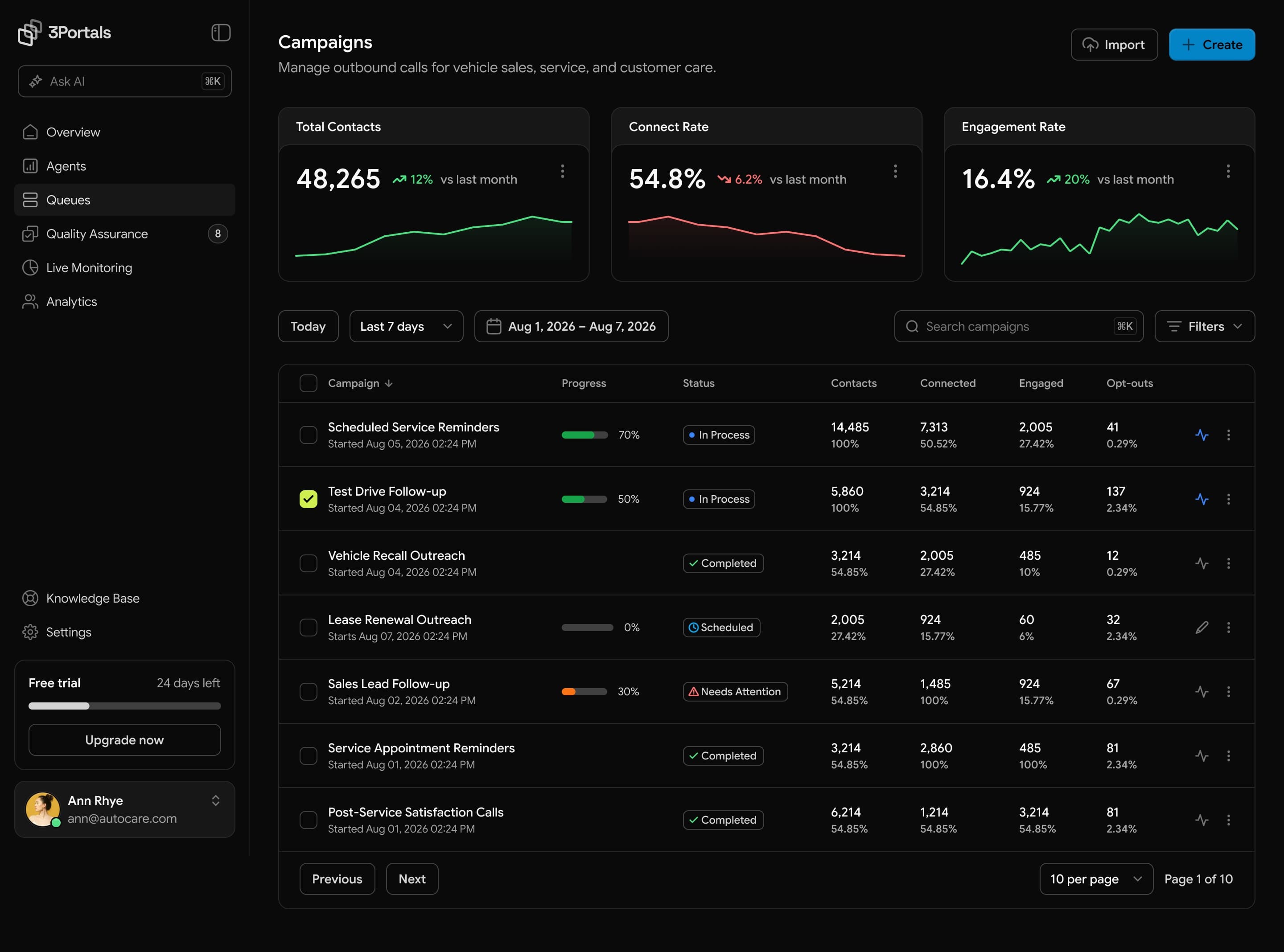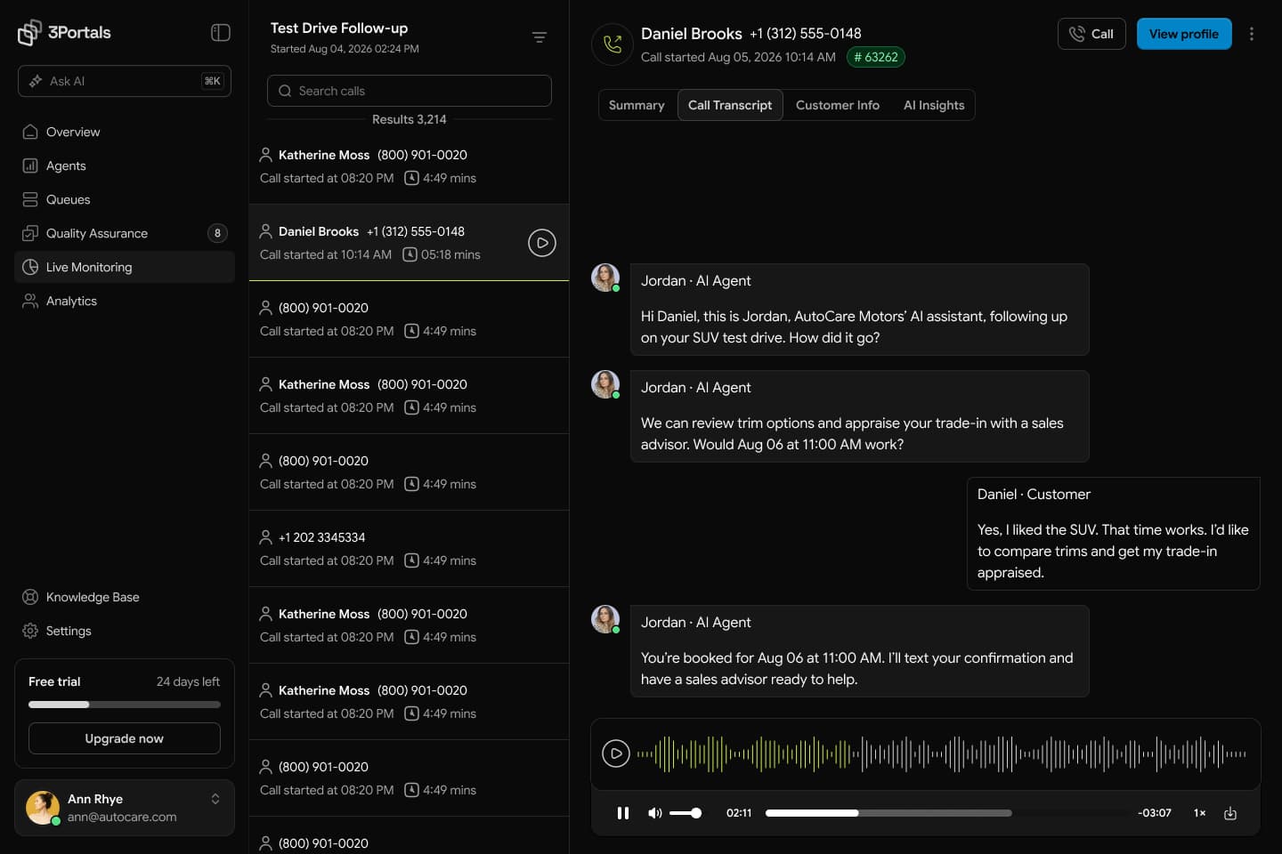

Lead with the task.
Give each module a clear starting point, with detail close to the work it supports.
Lumetrix brings analytics, content, and everyday operations into a shared interface. We designed a visual system that stays familiar in light and dark themes, and adapts from a wide desktop canvas to a phone.
A chart, an editor, a file library, and a map each need a different kind of space. The challenge was to make those differences feel intentional within one product.
Shared navigation, violet action colors, consistent controls, and a clear type hierarchy connect the modules. Responsive layouts change how information is arranged, while light and dark themes preserve what matters on each screen.
Give each module a clear starting point, with detail close to the work it supports.
Carry the same actions, chart colors, and reading order through both visual themes.
Turn wide tables, calendars, and panels into focused flows on a smaller screen.
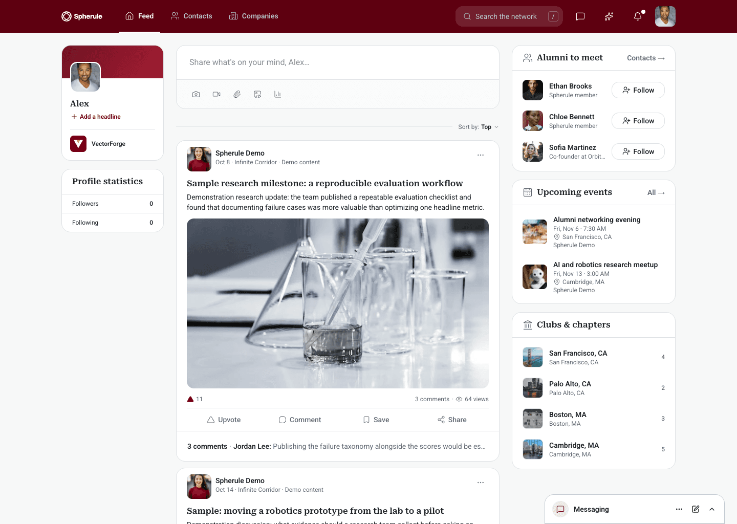
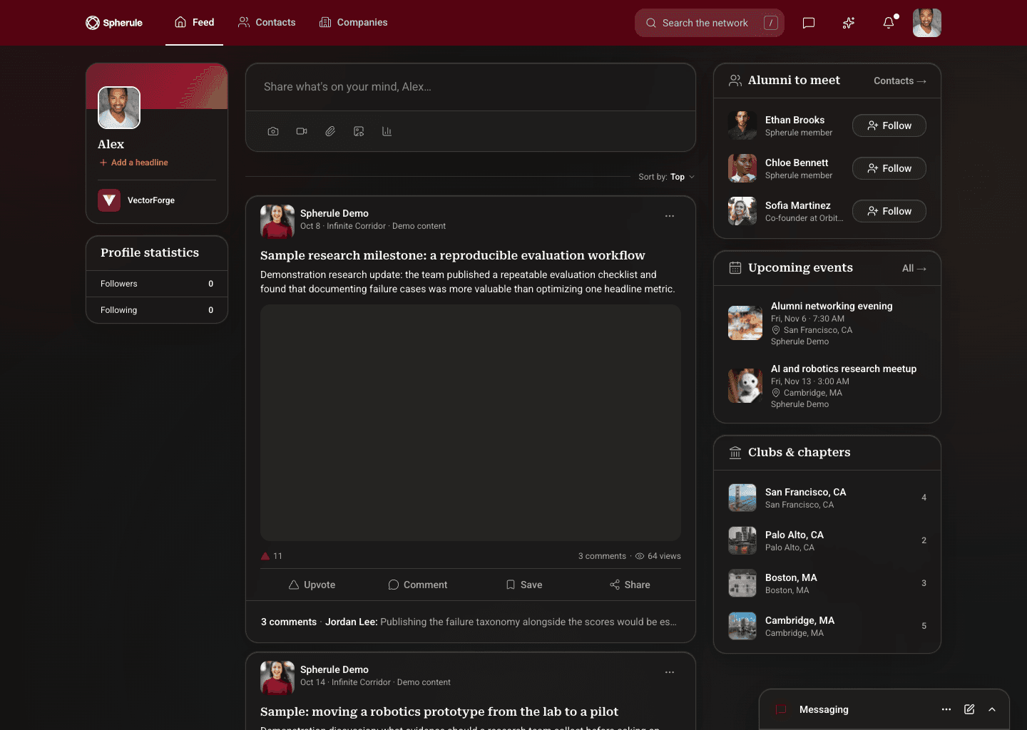
Switch between light and dark to see how each workflow adapts. Desktop and mobile stay together throughout.
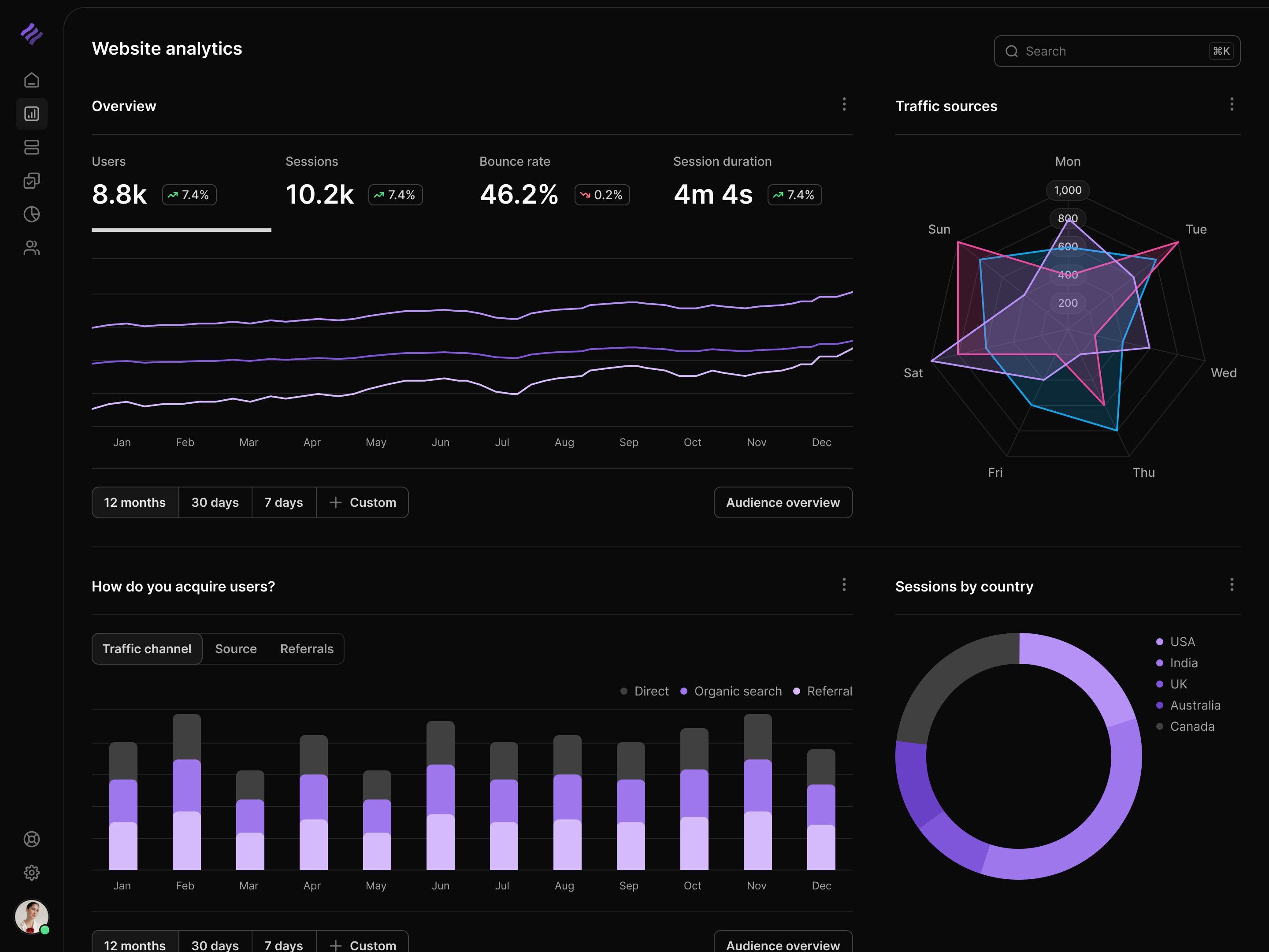
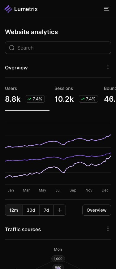
Website analytics
Overview metrics lead into traffic trends, audience comparisons, and acquisition sources. The mobile layout stacks the same information so the charts have room to remain useful.
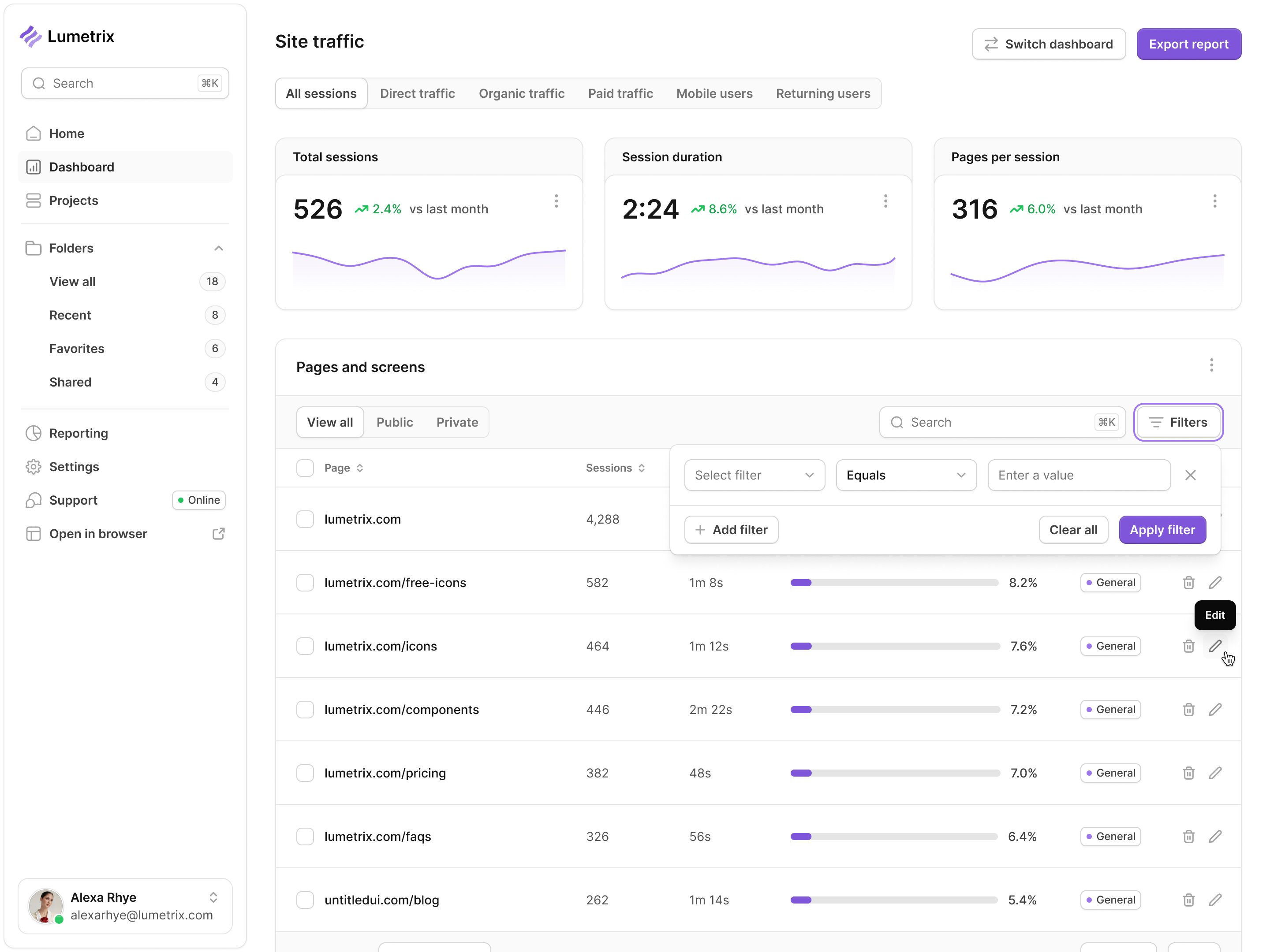
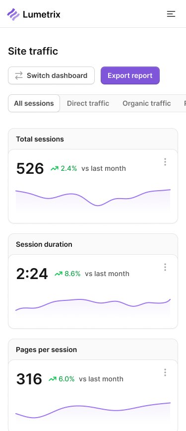
Site traffic
Visitors, session duration, and pages per session sit above the page-level table. On a phone, each metric becomes its own card rather than compressing the desktop table into a narrow viewport.
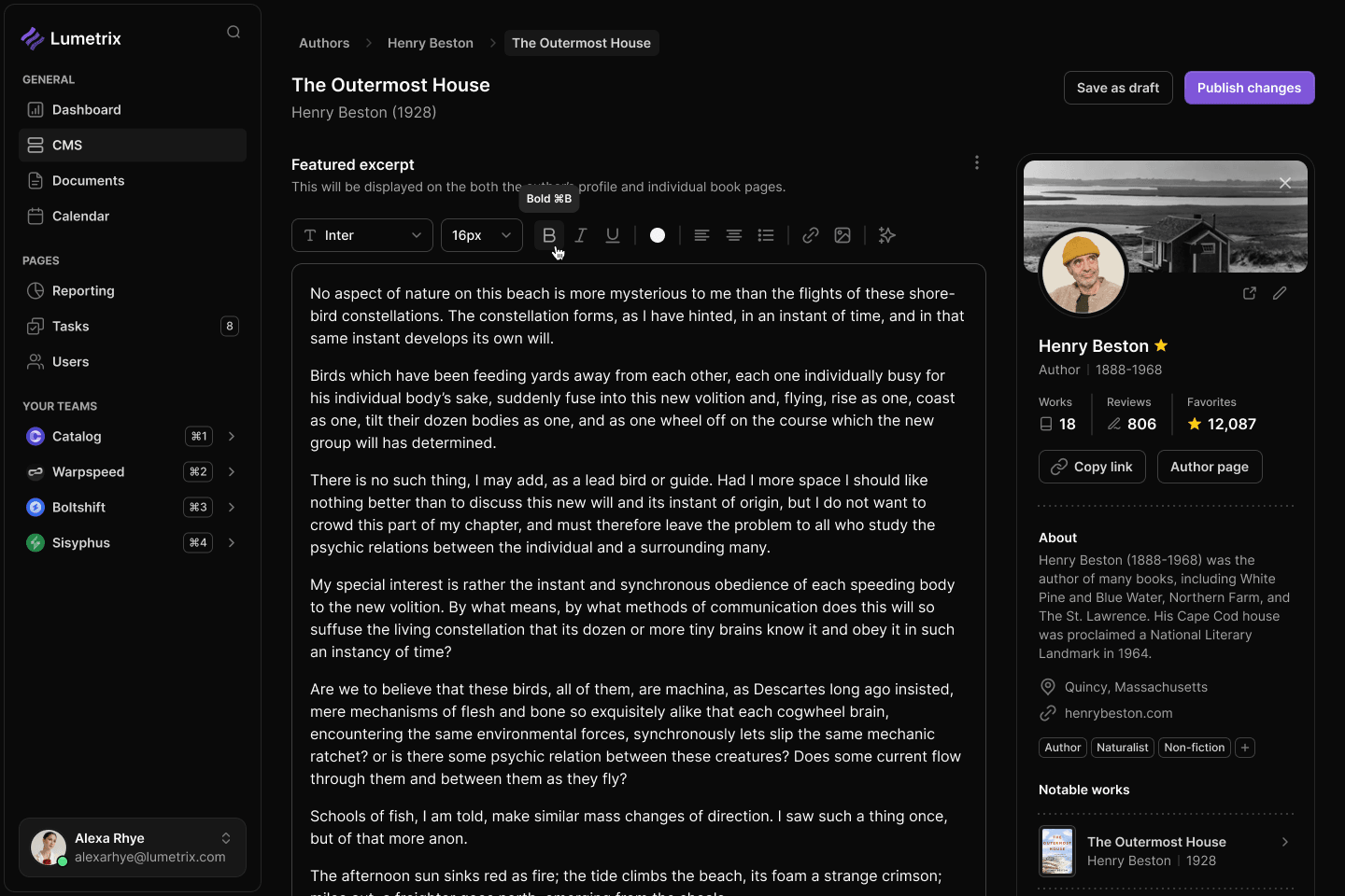
Content workspace
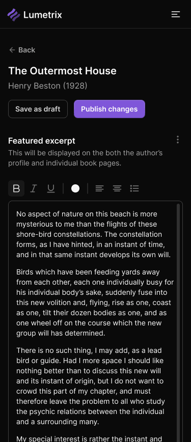
The editor keeps formatting close to the text and author information alongside it. On mobile, the content takes the lead, with publishing controls still within reach.
Calendar
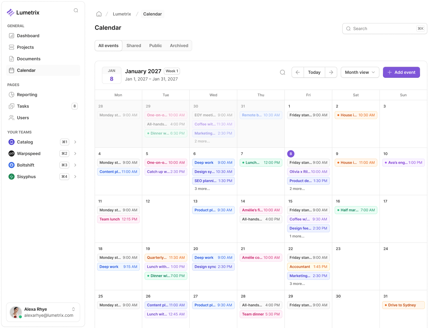
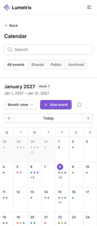
Color distinguishes events in the desktop week view. The phone combines a compact month selector with an agenda, changing the layout to suit the task instead of shrinking every calendar cell.
Files and assets
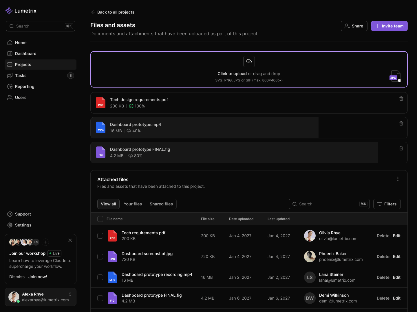
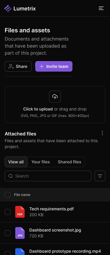
A visible upload area leads into attached files and a searchable library. File types, owners, and timestamps give the desktop table context; the mobile view prioritizes uploading and finding a file.
Location discovery
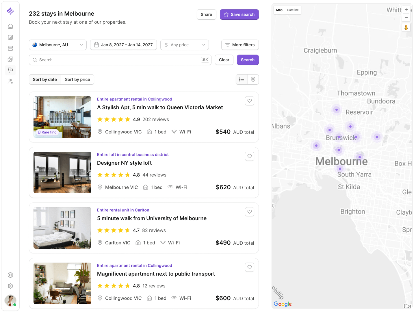
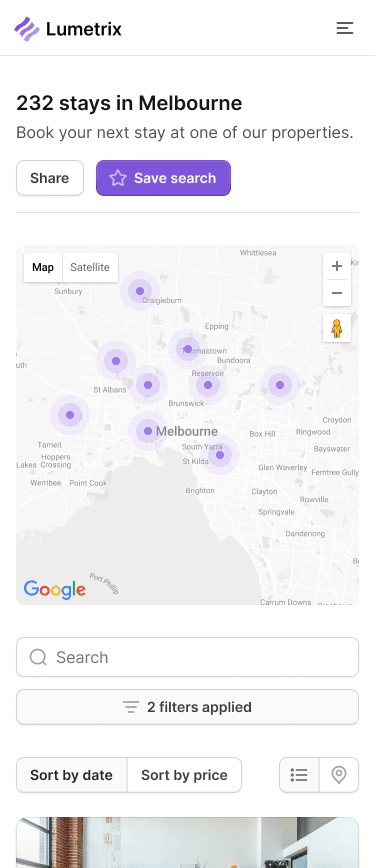
Desktop places the results beside the map so users can compare stays without switching views. Mobile brings the map above the search and filters, then continues into the property list.
Trade history
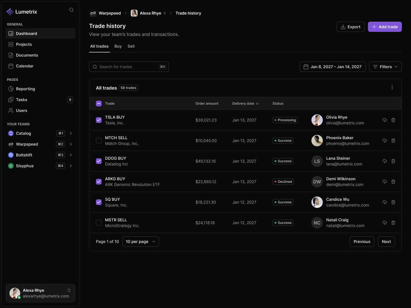
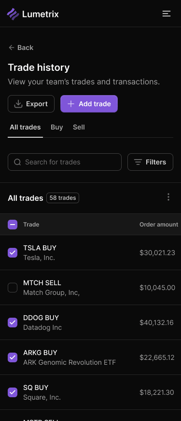
Search, buy and sell filters, and export actions frame the transaction history. Mobile keeps the asset and amount together in a compact list while retaining the controls above it.
Messaging
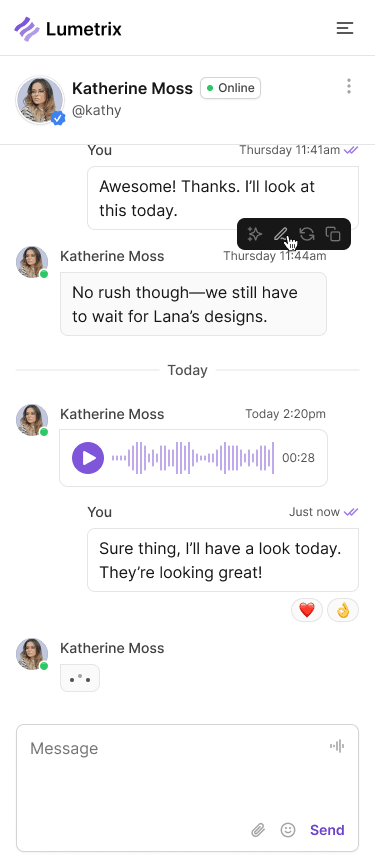
The desktop view combines an inbox and an open conversation. On mobile, the active conversation fills the screen, with attachments, voice messages, and the composer kept in the same flow.

Personal settings
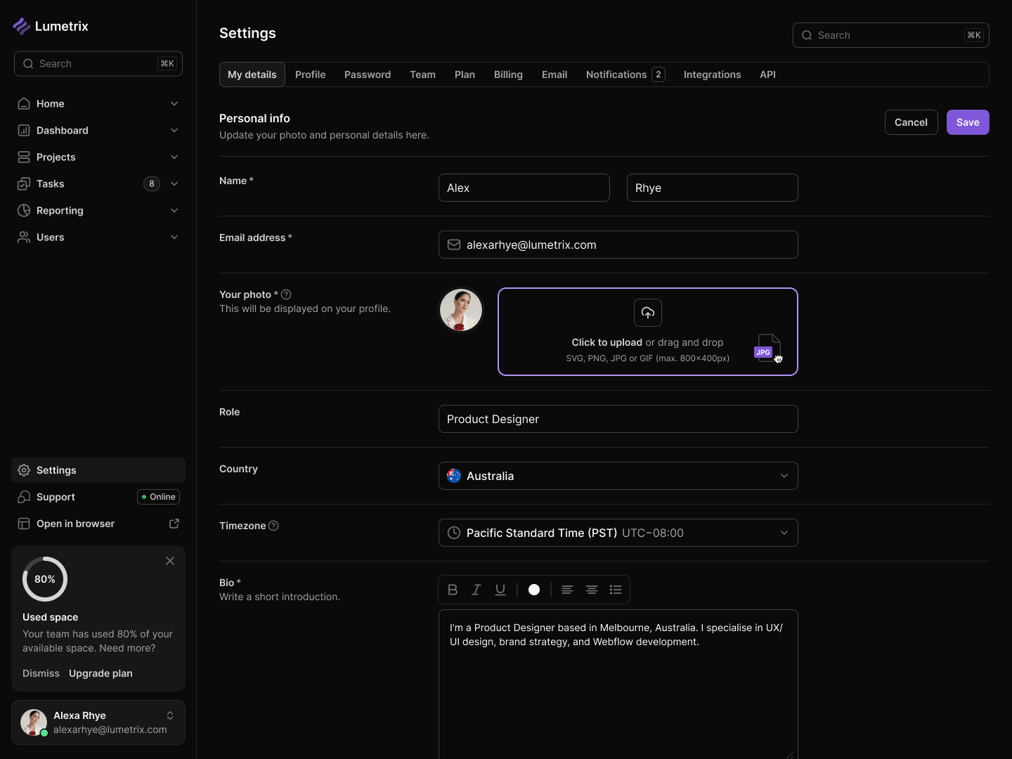
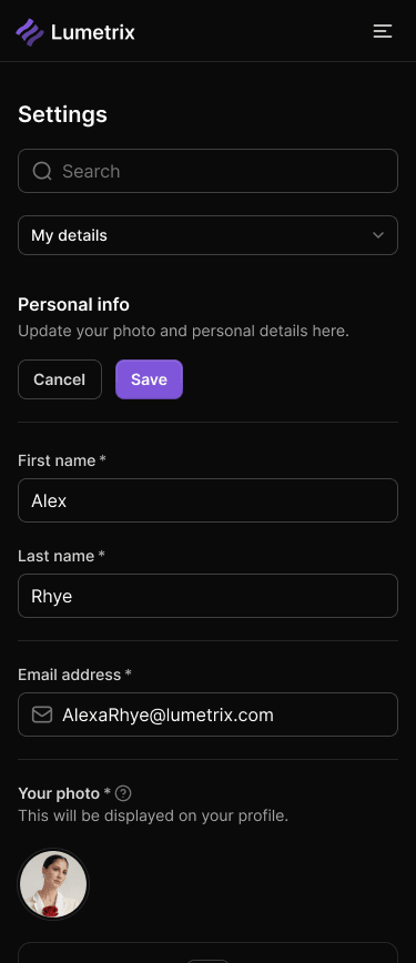
Personal information, profile photography, and preferences are grouped into a clear form. The phone preserves the same field order and places save and cancel controls near the section being edited.
Account access
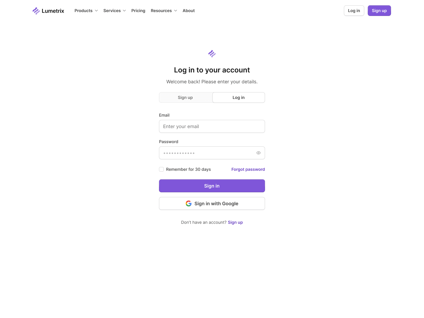
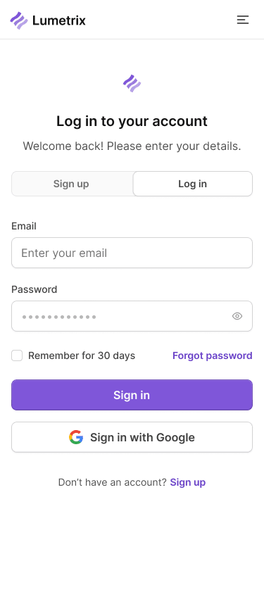
The login screen gives the form a quiet center, with password recovery and an alternative sign-in option nearby. Both themes carry that hierarchy through to the phone.
Account creation
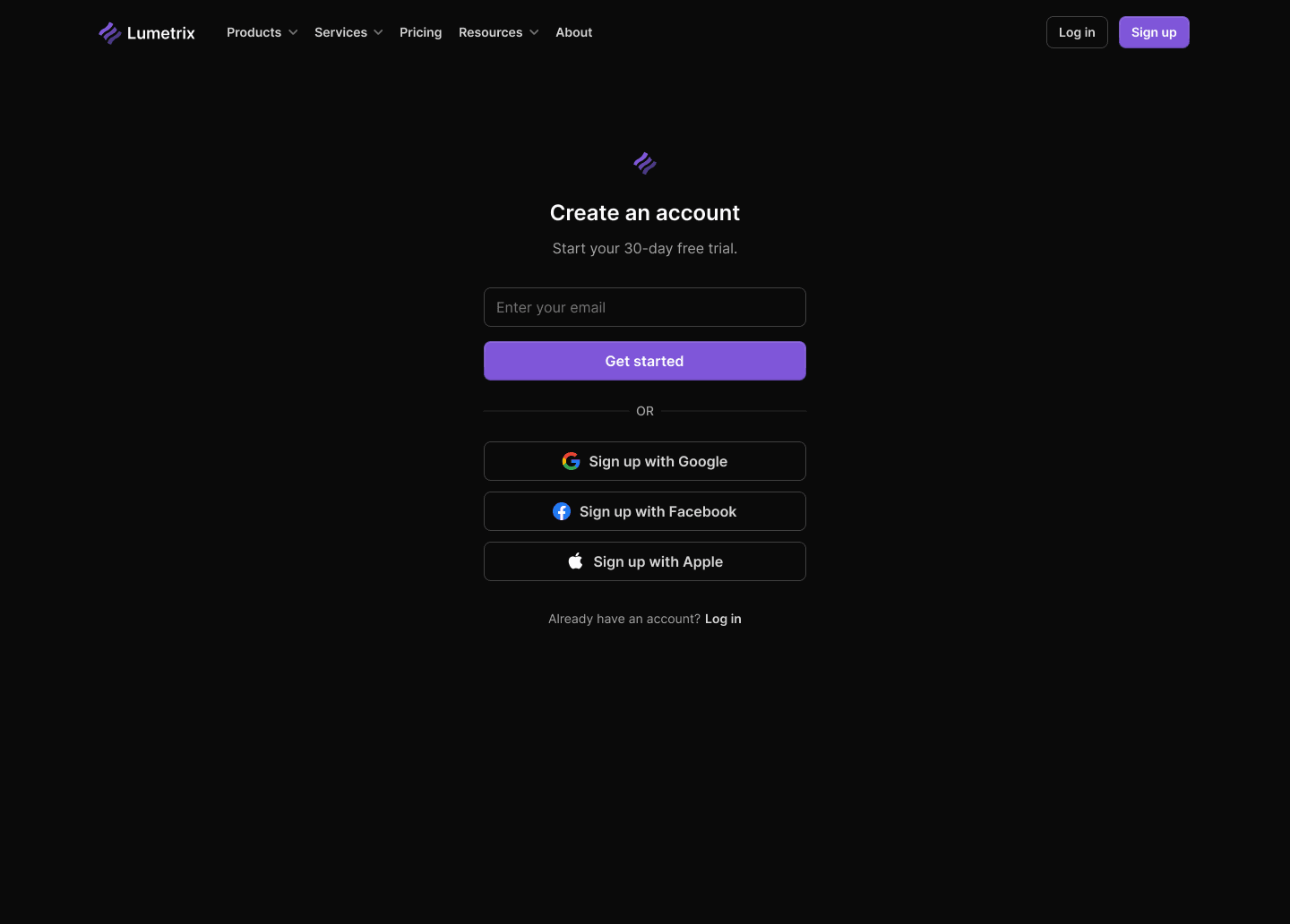
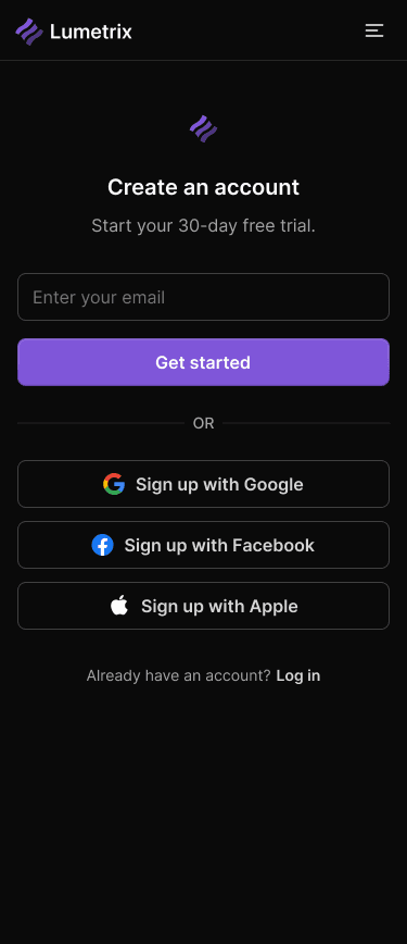
An email field and familiar sign-up options keep the first step focused. The desktop and mobile screens use the same sequence, with enough space to distinguish each choice.
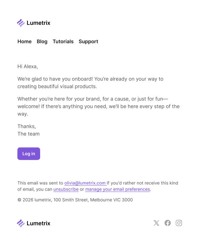
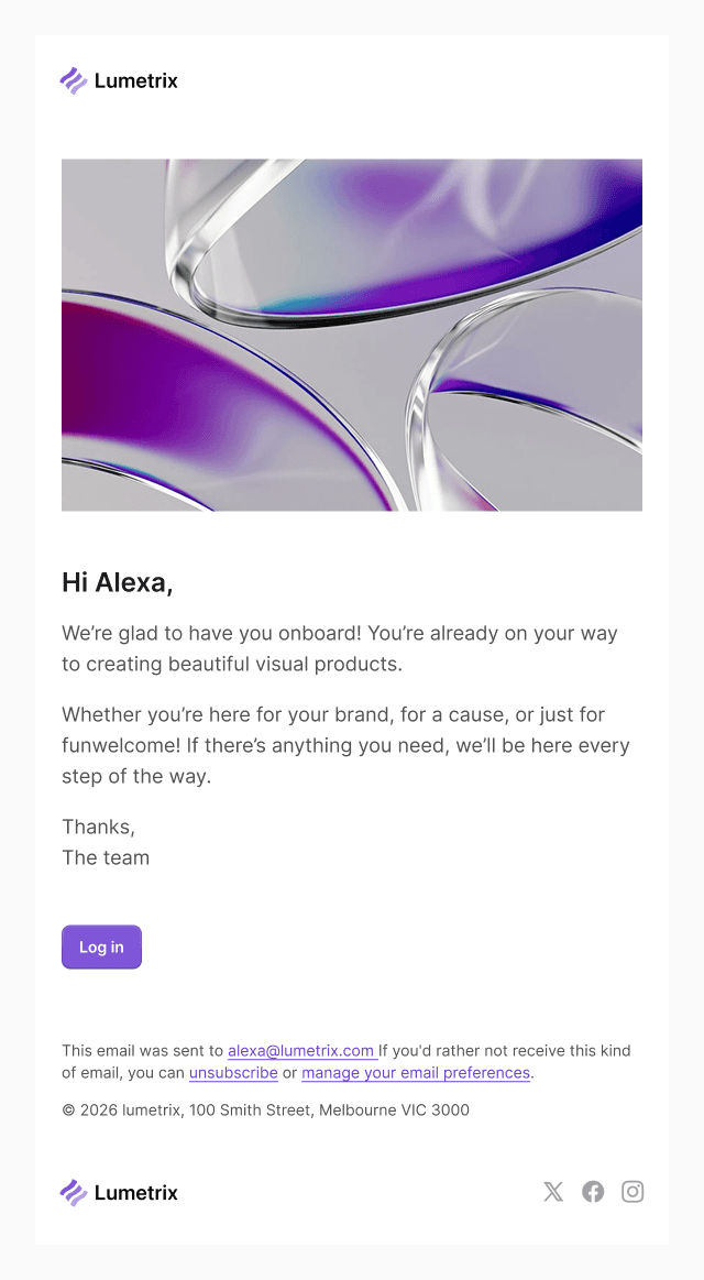
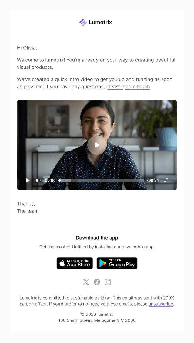
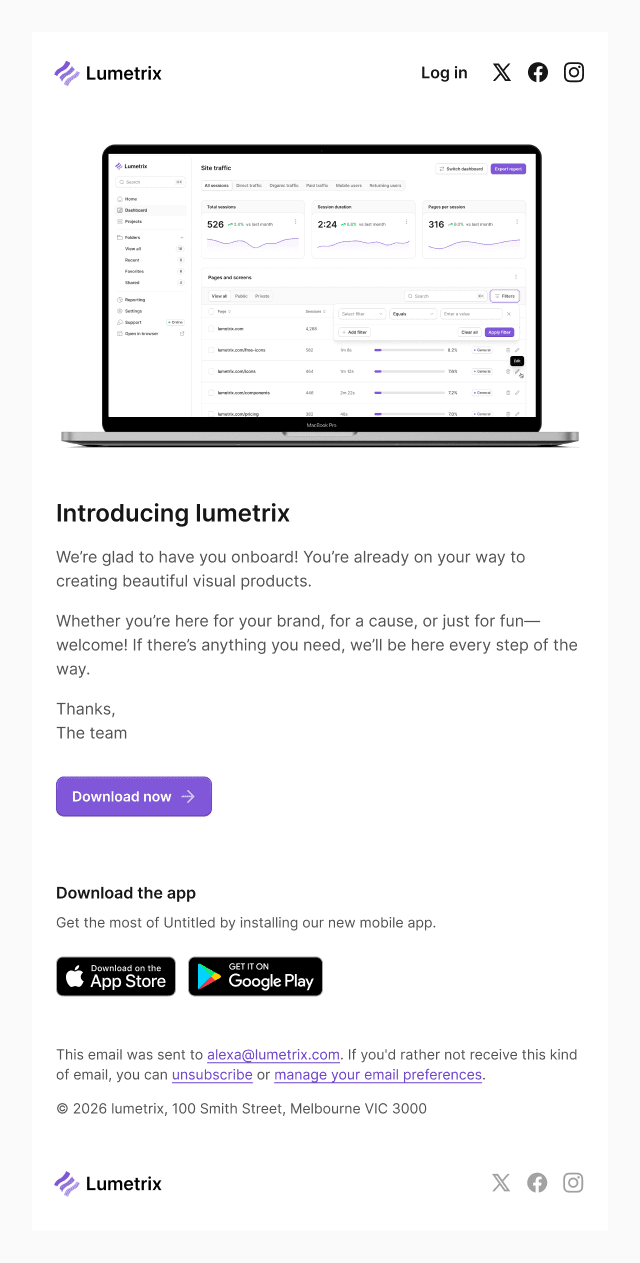
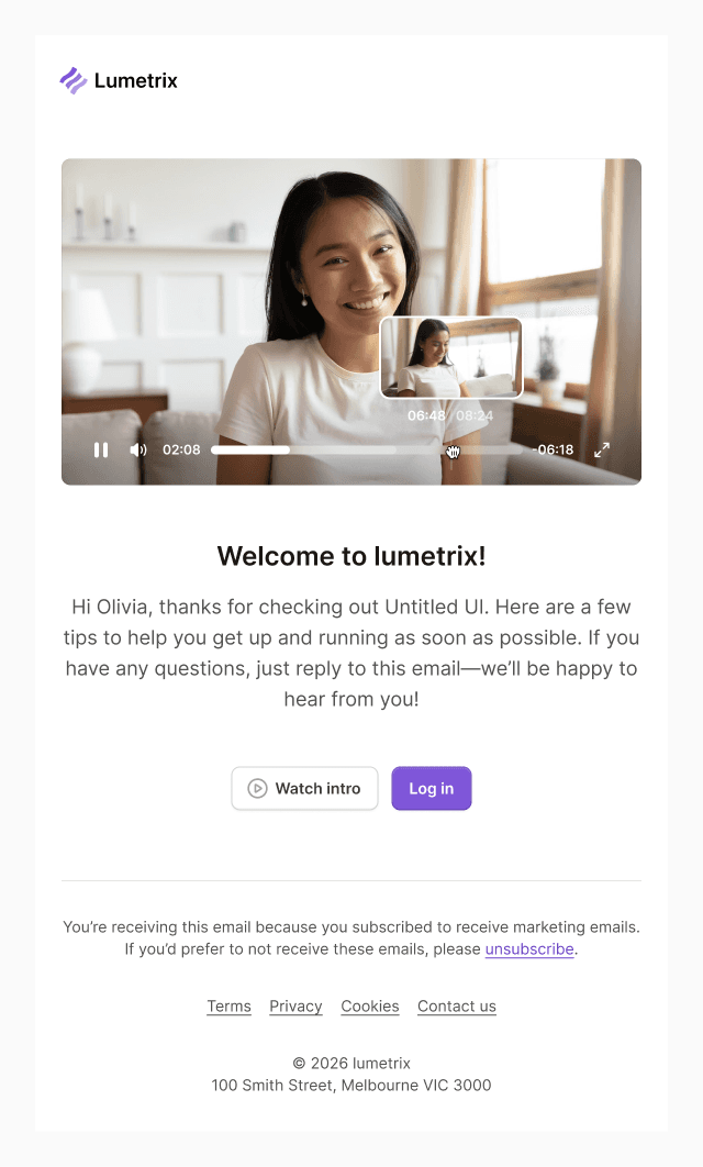
Onboarding, product updates, invitations, and verification share one set of email components: the same logo lockup, type scale, buttons, and footer, arranged for each message.
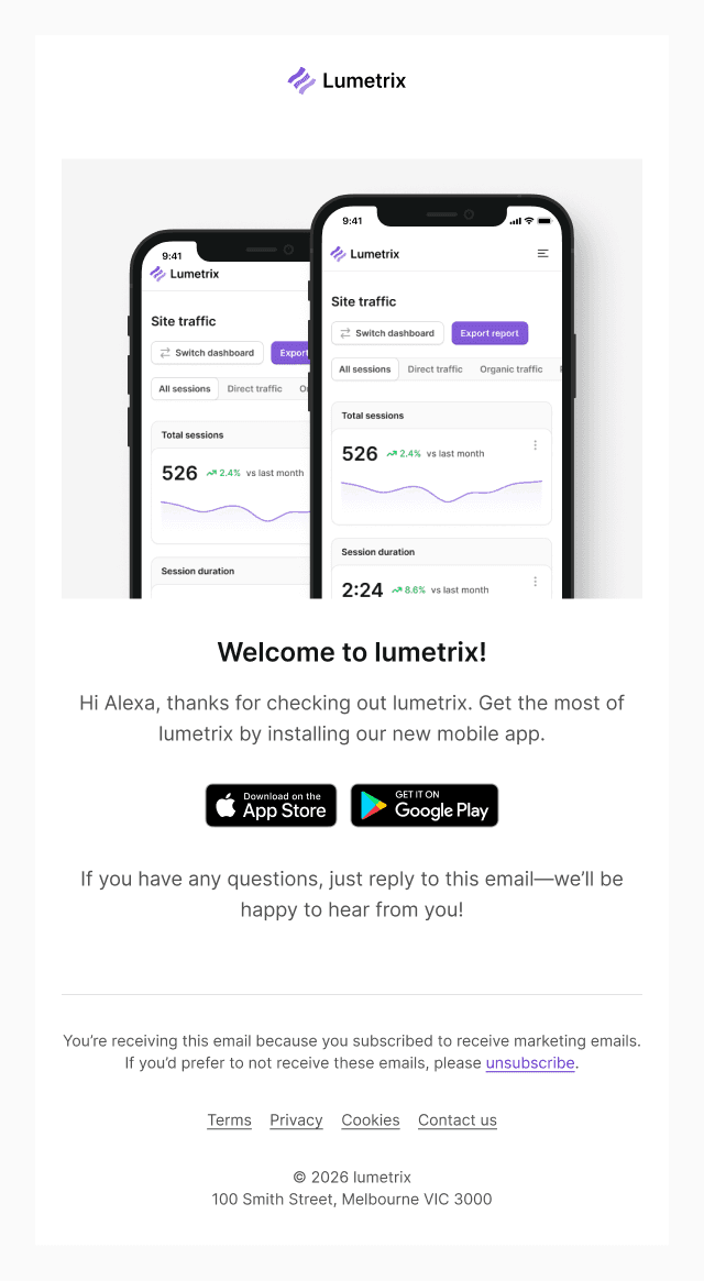
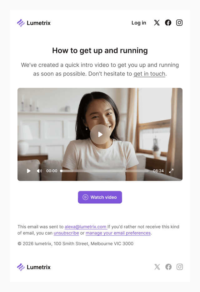
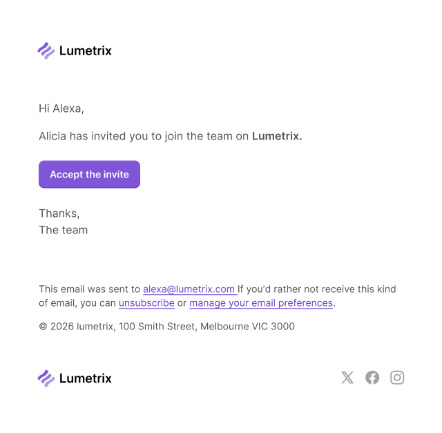
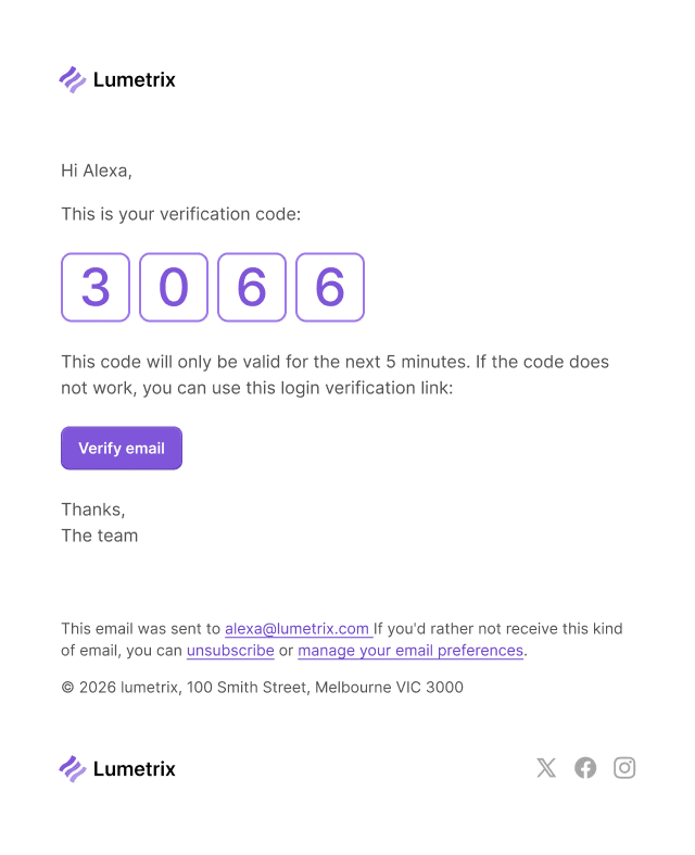
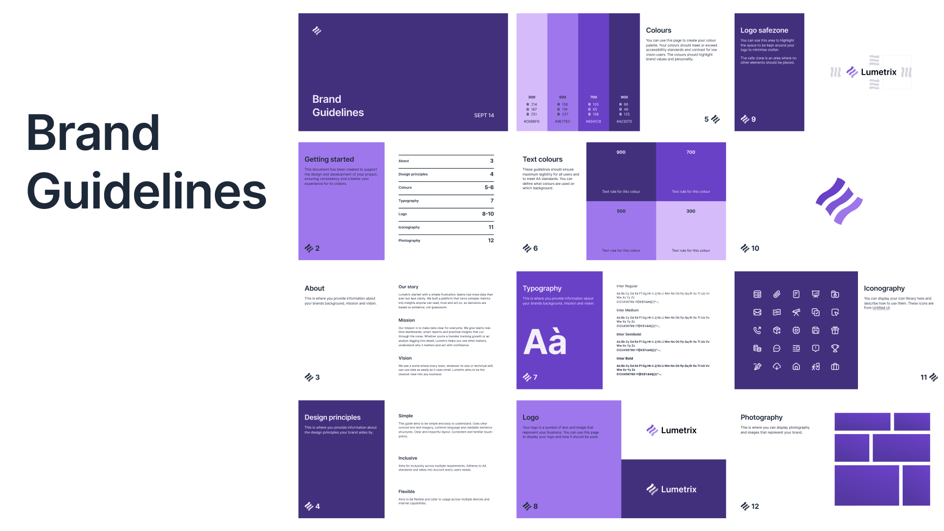
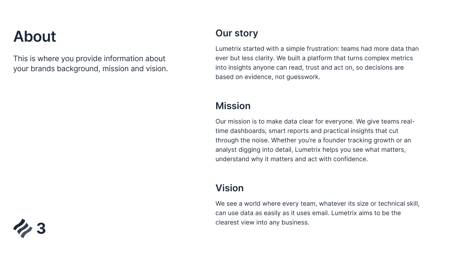
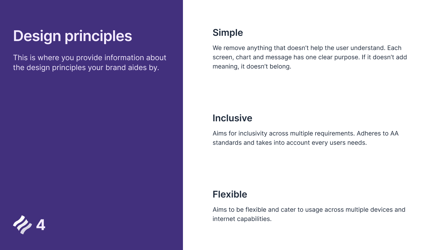
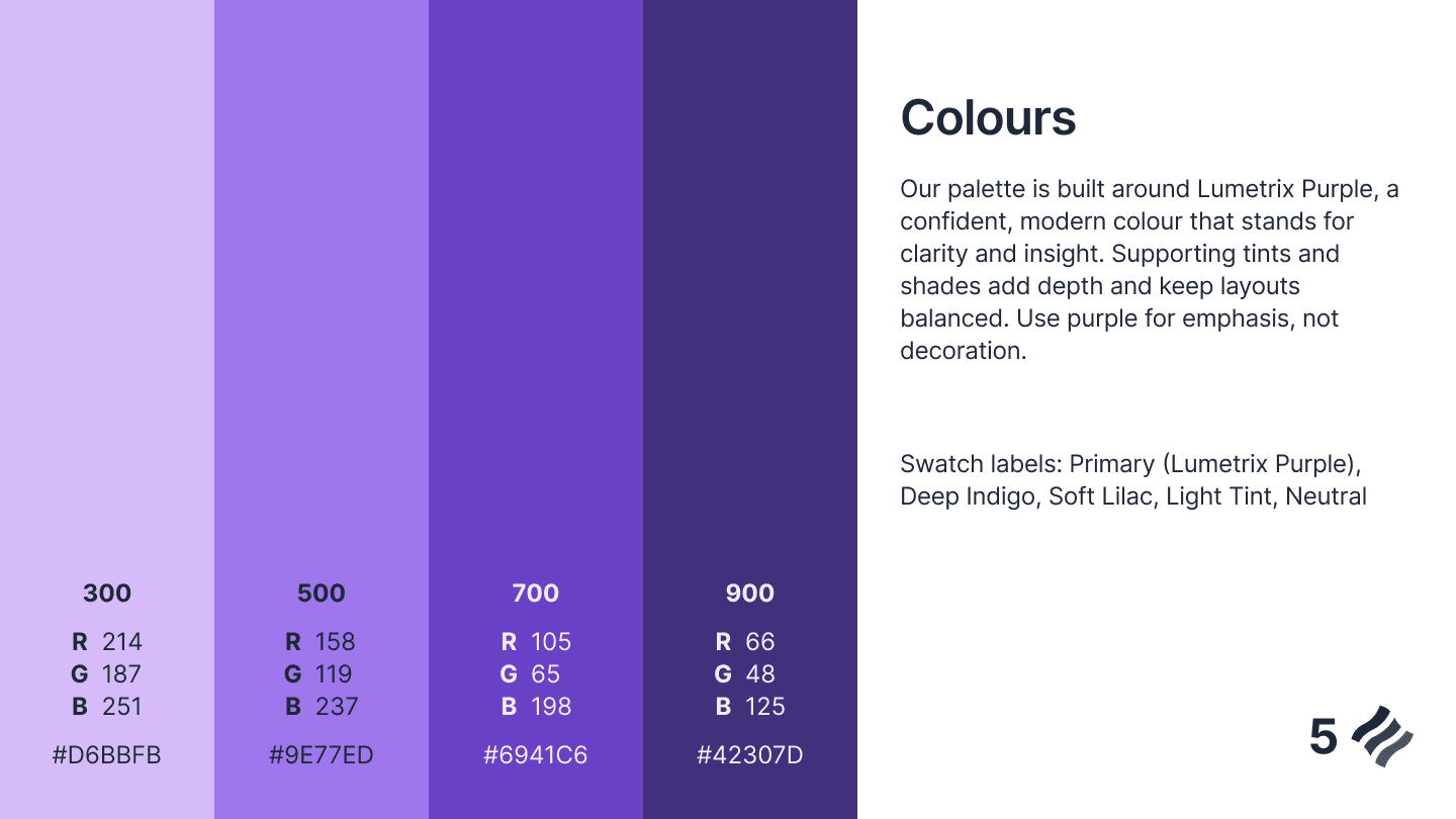
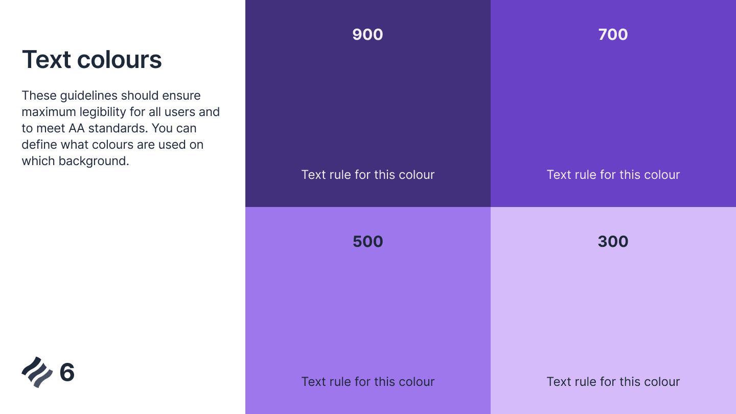
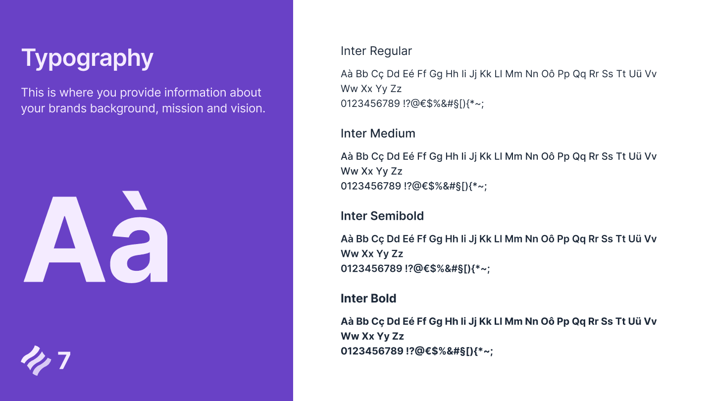
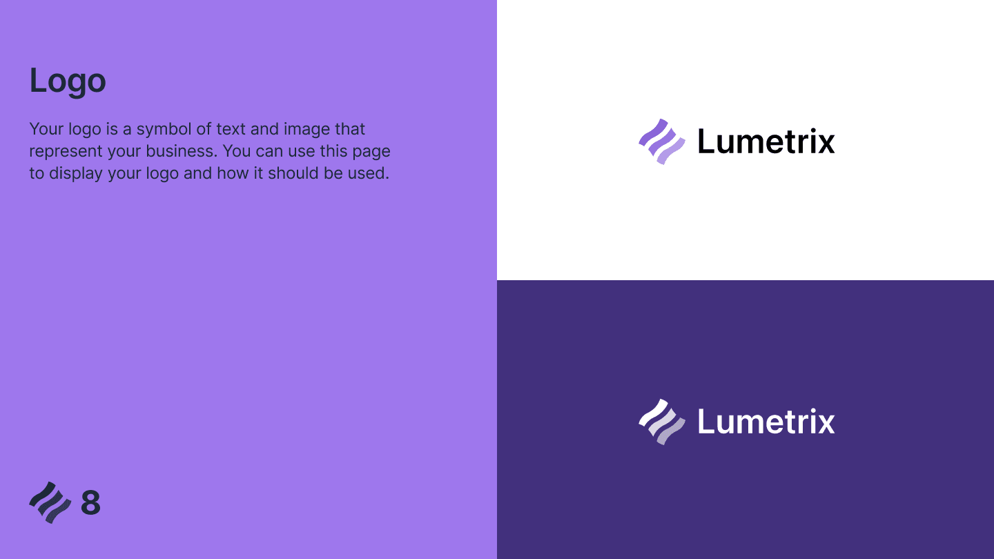
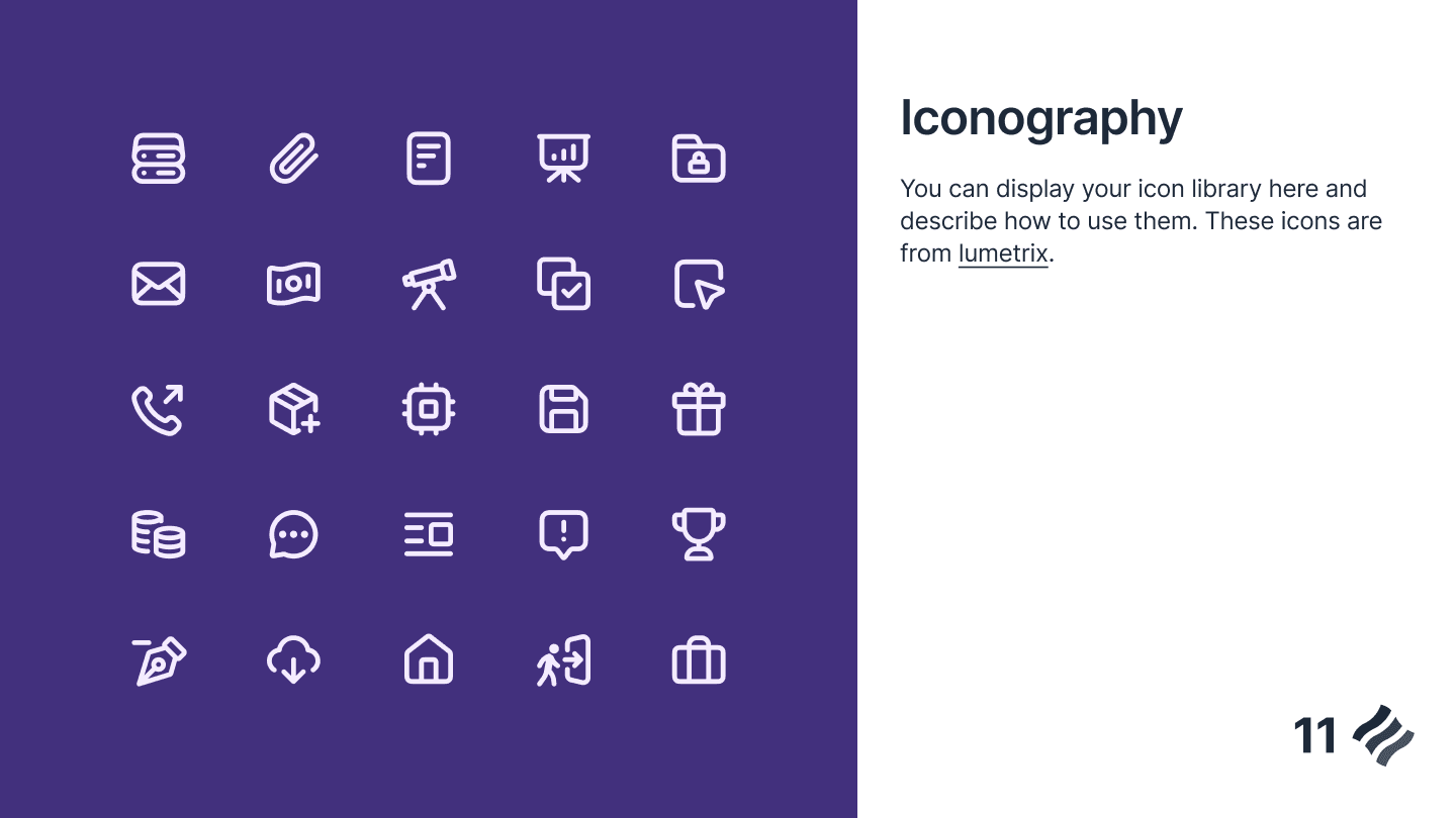
The guidelines set out the logo and its safe zone, a violet palette with text pairings for each tone, Inter as the type family, and an icon library, so every screen, email, and deck starts from the same foundation.

The screens show a consistent approach across analytics, publishing, scheduling, files, locations, and account management. Each module uses the space it needs while keeping navigation and controls recognizable.
Light and dark are part of the same system. Mobile carries that system into layouts designed for a narrower view, from stacked metrics to focused conversations and compact activity lists.
A product with many moving parts?
Bring us the screens, the workflows, and the places where things feel disconnected. We'll help you build a product that holds together.