
Too many messages
A broad product suite with no single thing it stood for.
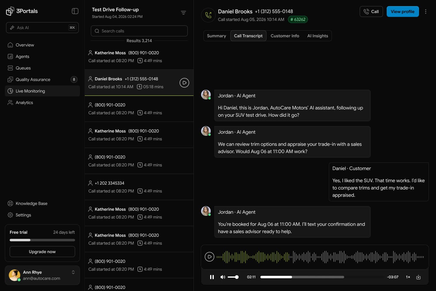
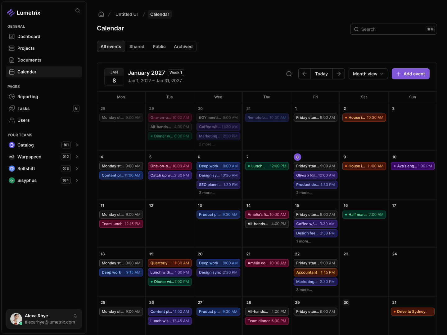
Phoenix runs complex infrastructure programs across teams, assets, and locations. We redesigned the enterprise platform so dense operational work feels clear, consistent, and fast across desktop and mobile.
Infrastructure projects pull operators, municipalities, vendors, contractors, and field crews into one process. Most of them were still running it on paper, email, and spreadsheets.
Phoenix already had the technology to pull all of that together. It just did not feel unified yet, not for an executive reading a dashboard, and not for a technician working off a phone in the field.
A broad product suite with no single thing it stood for.
Real operational data that still had to move fast on screen.
Office and field teams working the same job on different devices.
Clear hierarchy, reusable interaction patterns, and shared product logic across enterprise dashboards and mobile workflows.
We started with the work users needed to complete: understanding performance, finding problems, approving changes, and moving projects forward without losing context.
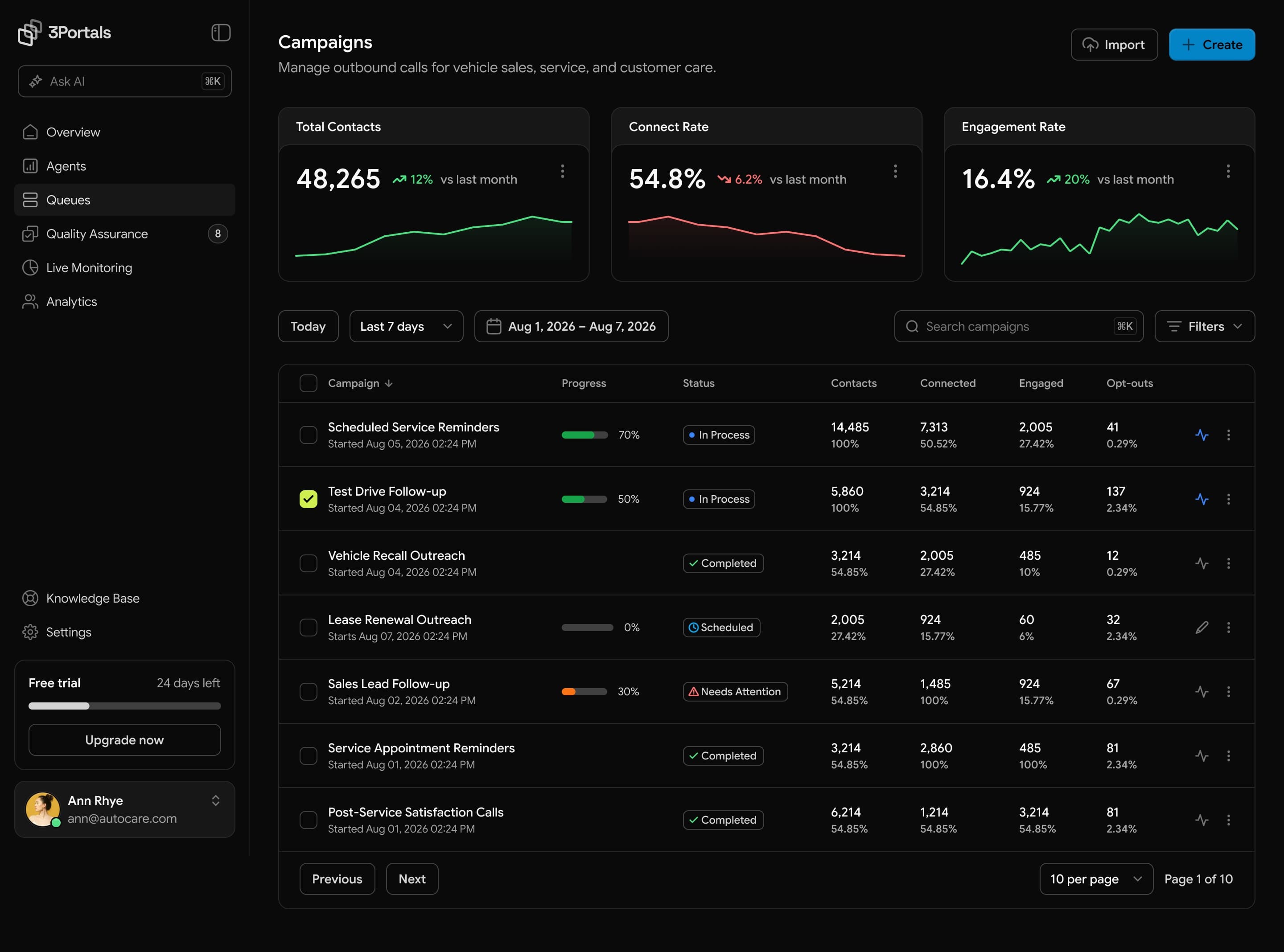
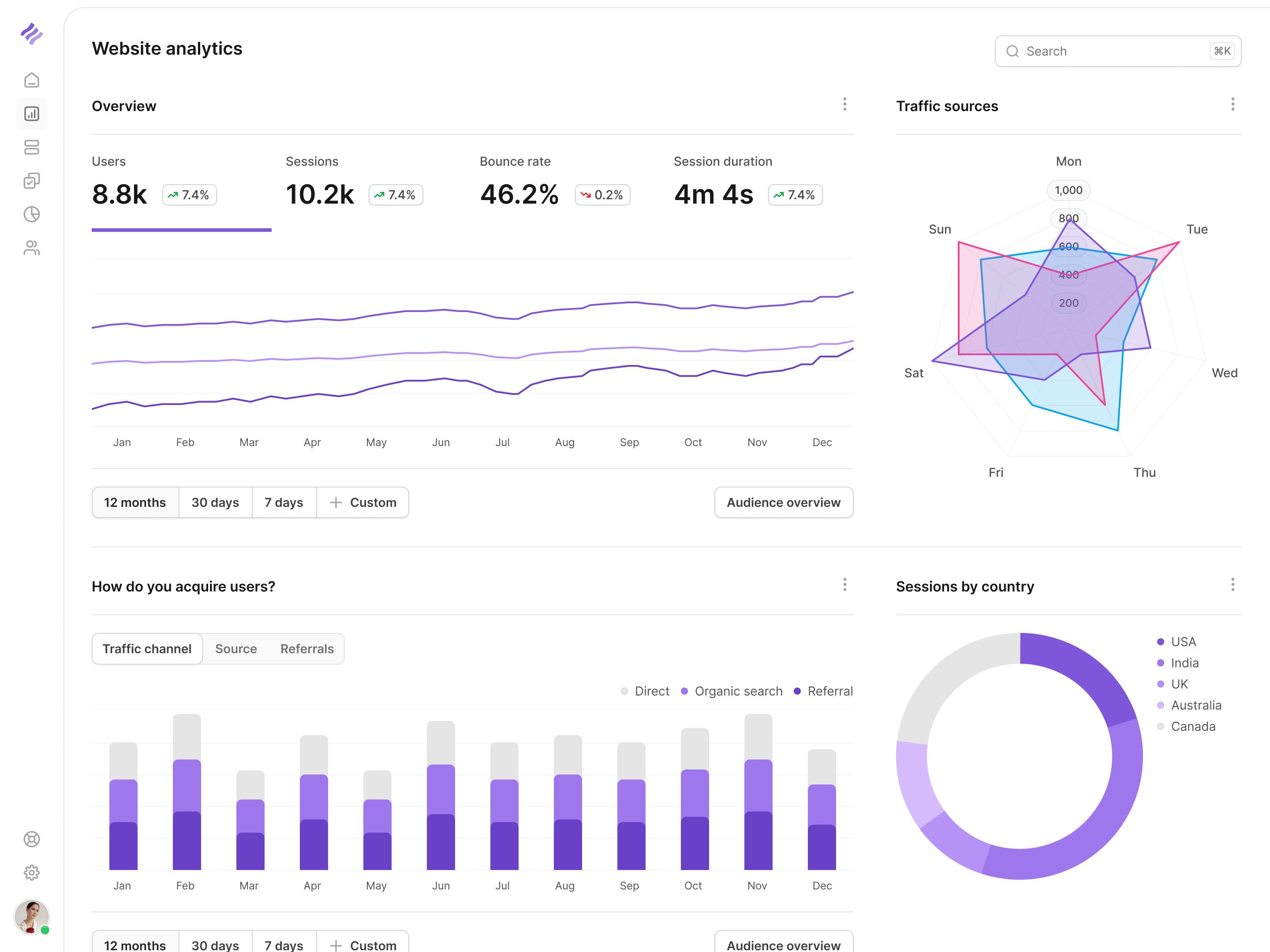
Dense operational data became clear hierarchies, reusable controls, and task-first mobile flows. The same patterns now scale across modules, roles, and devices instead of treating every screen as a separate design problem.
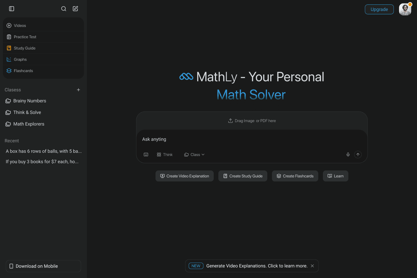
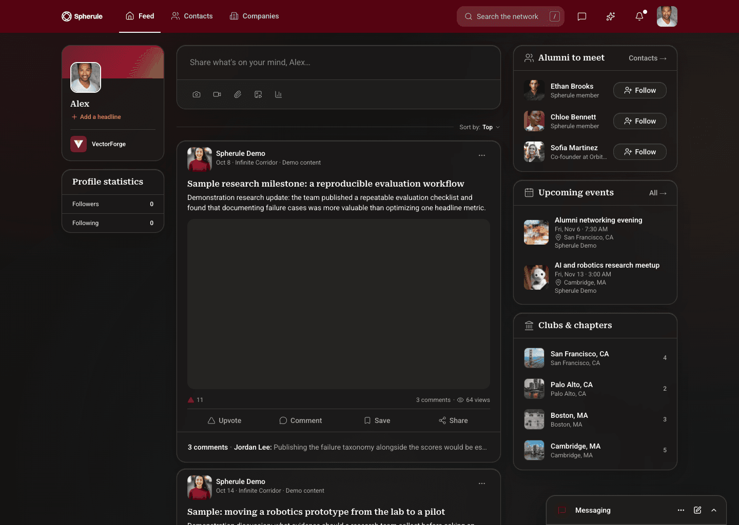
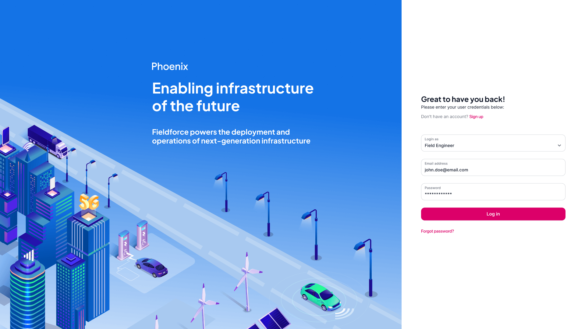
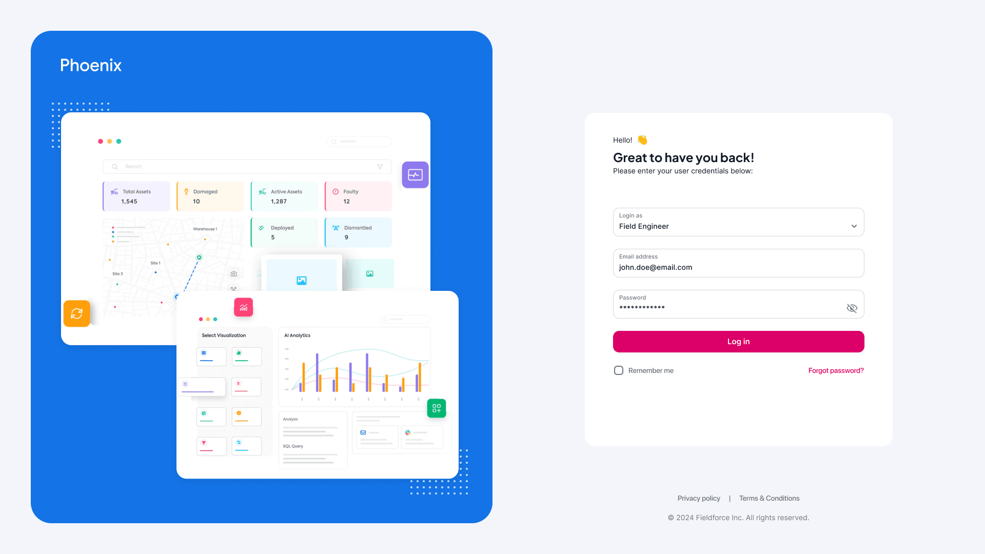
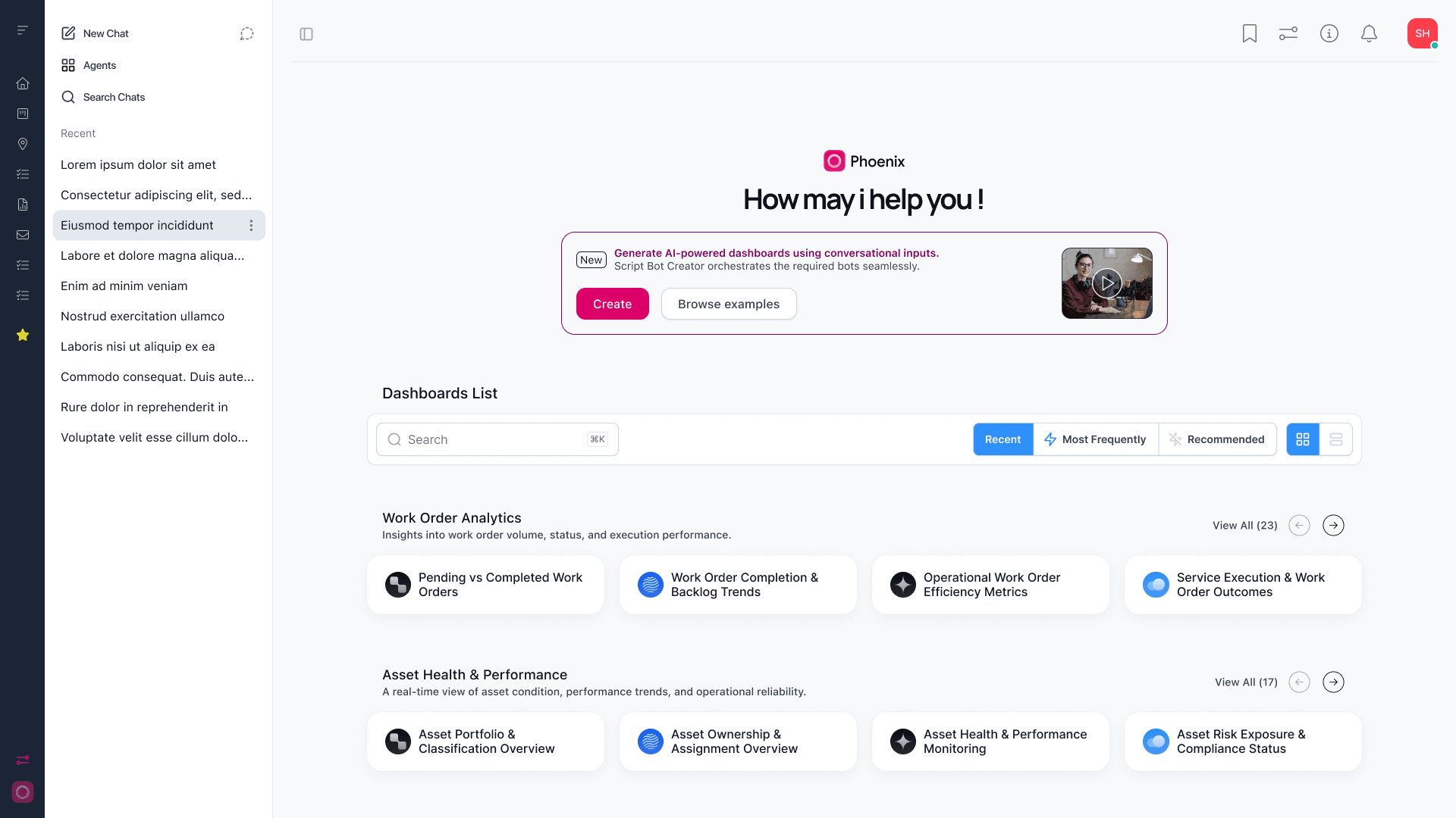
The sign-in concepts pair a focused login form with a preview of the platform. Inside, the home screen brings dashboards, tools, and AI shortcuts together so users can choose where to begin.
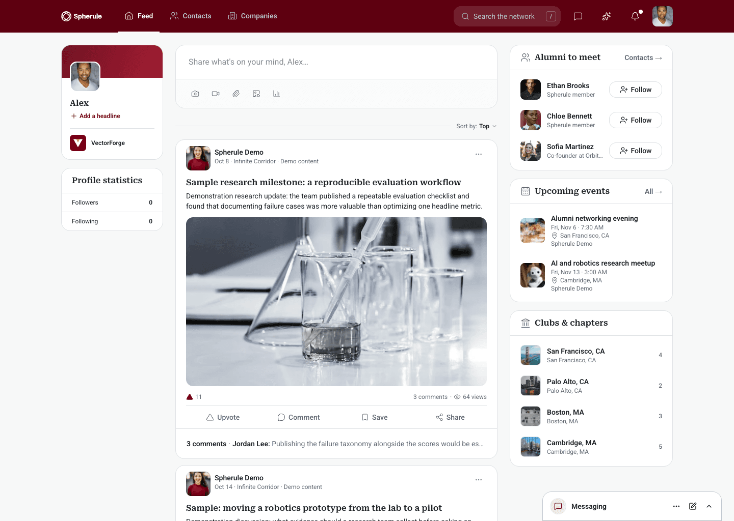
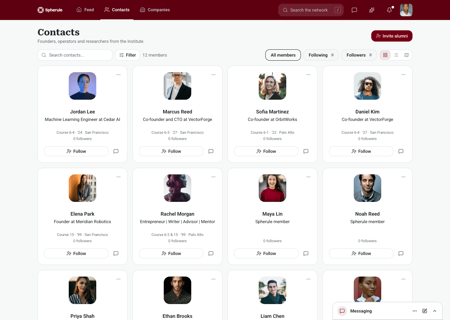
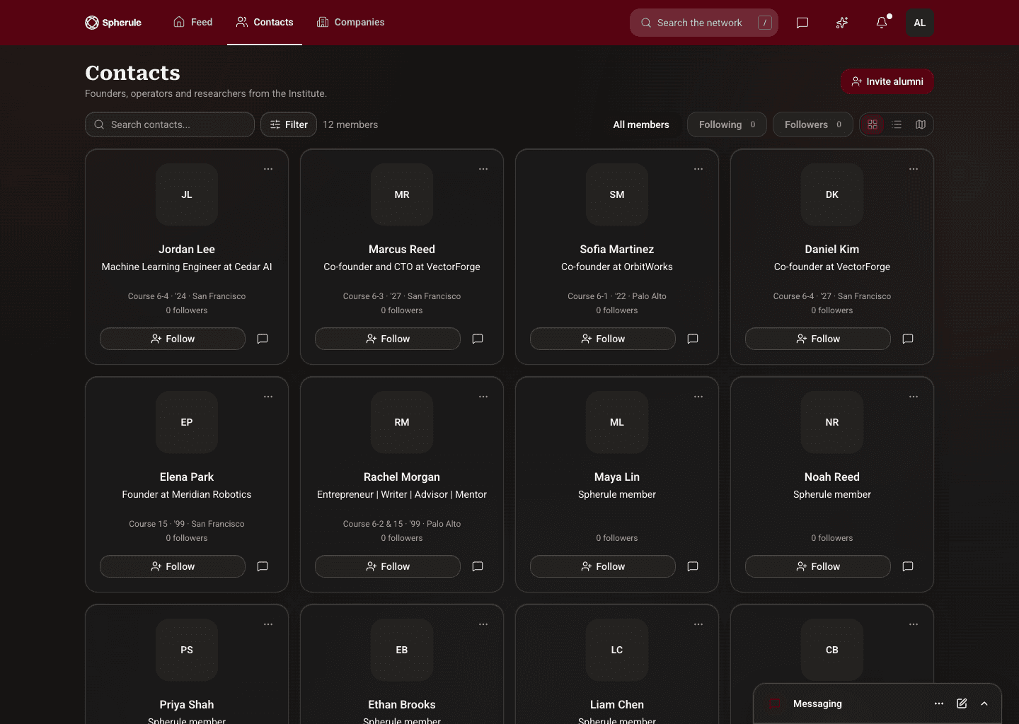
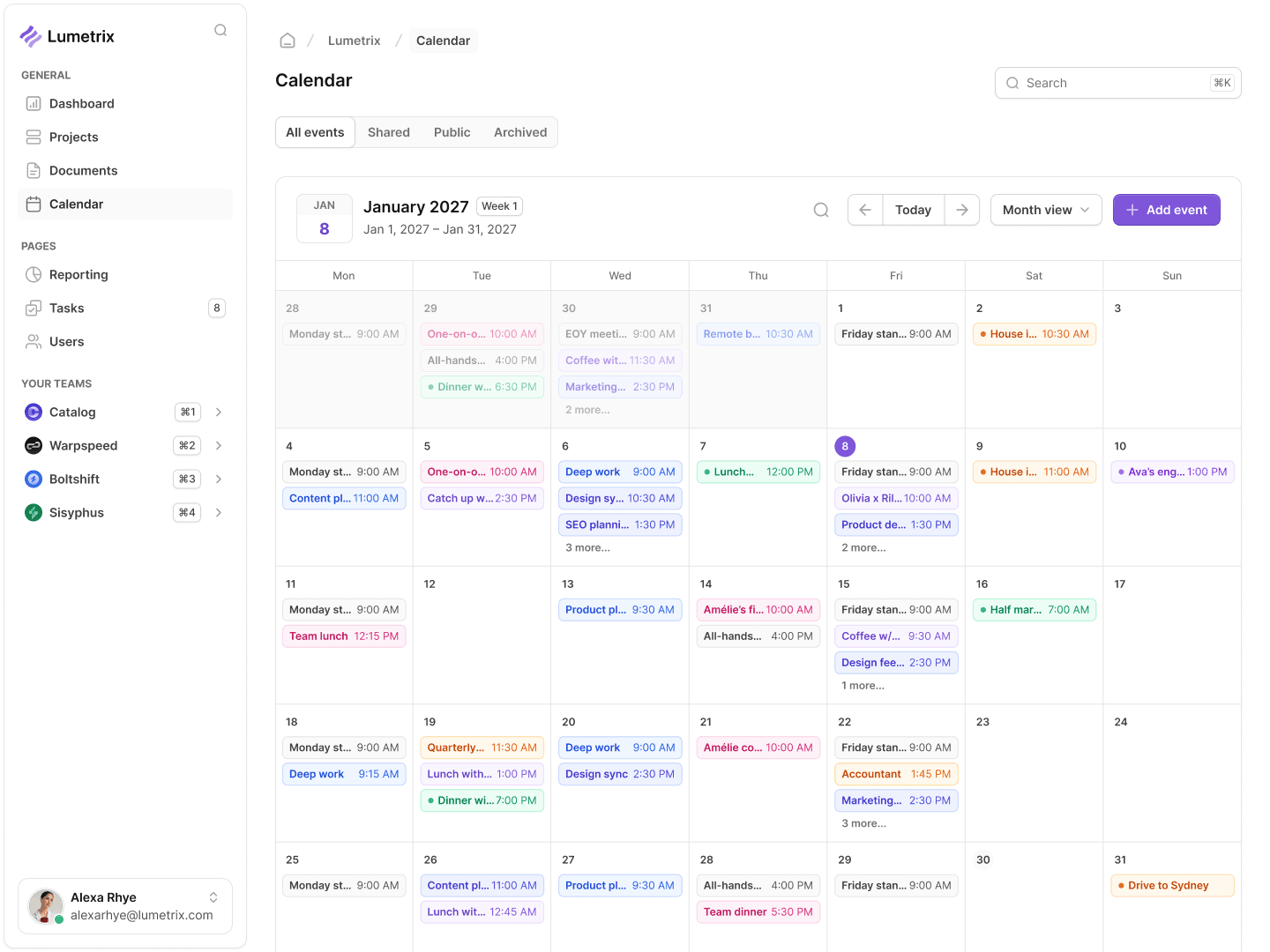
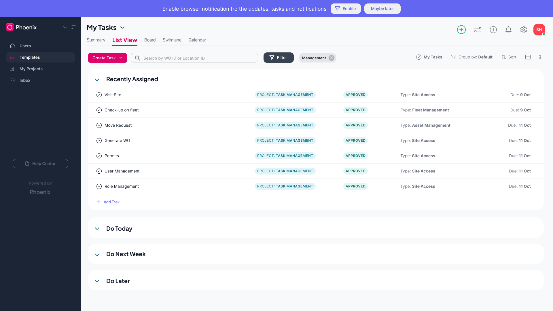
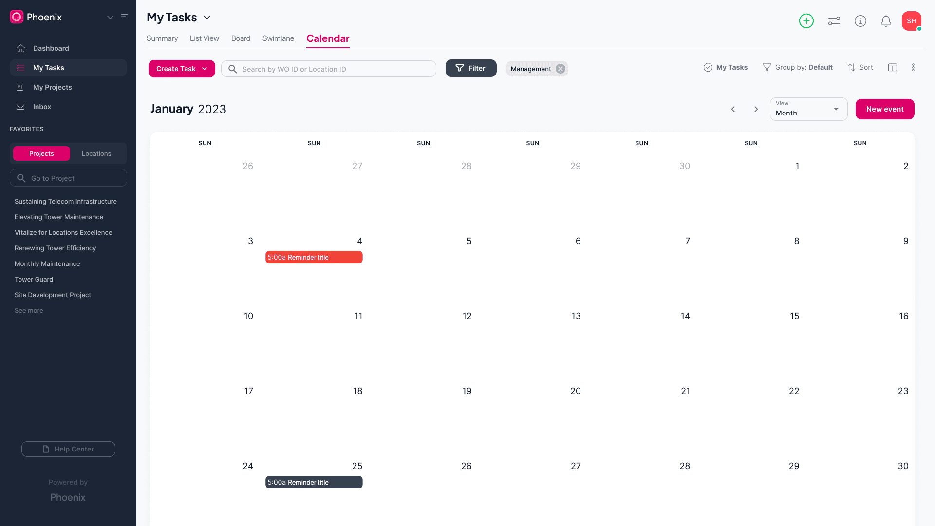
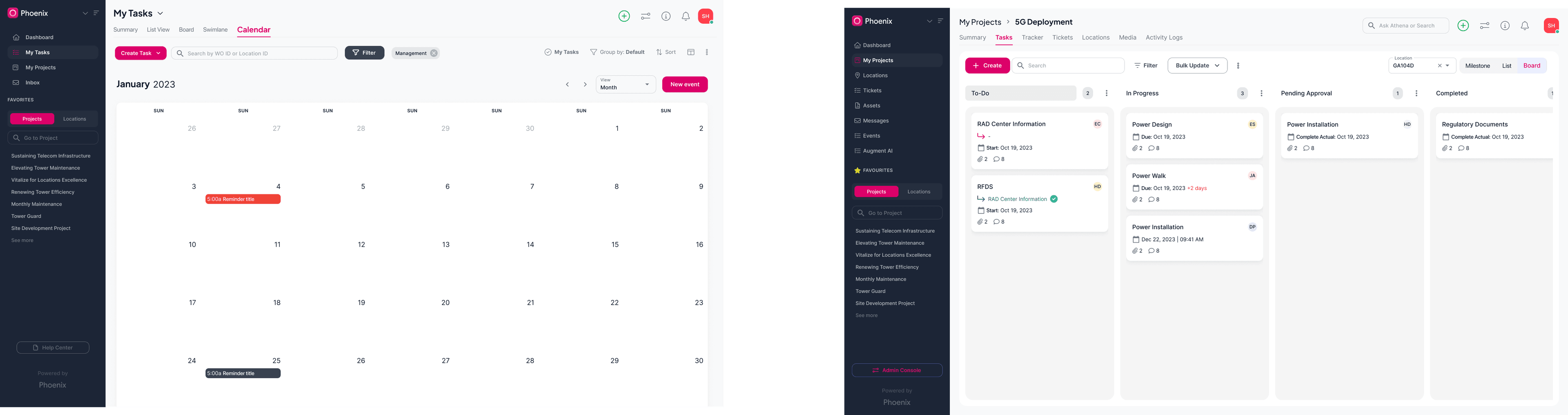
The task list groups assignments by when they need attention. Calendar and board views offer different ways to plan the same workload, while shared navigation and filters keep the surrounding context familiar.
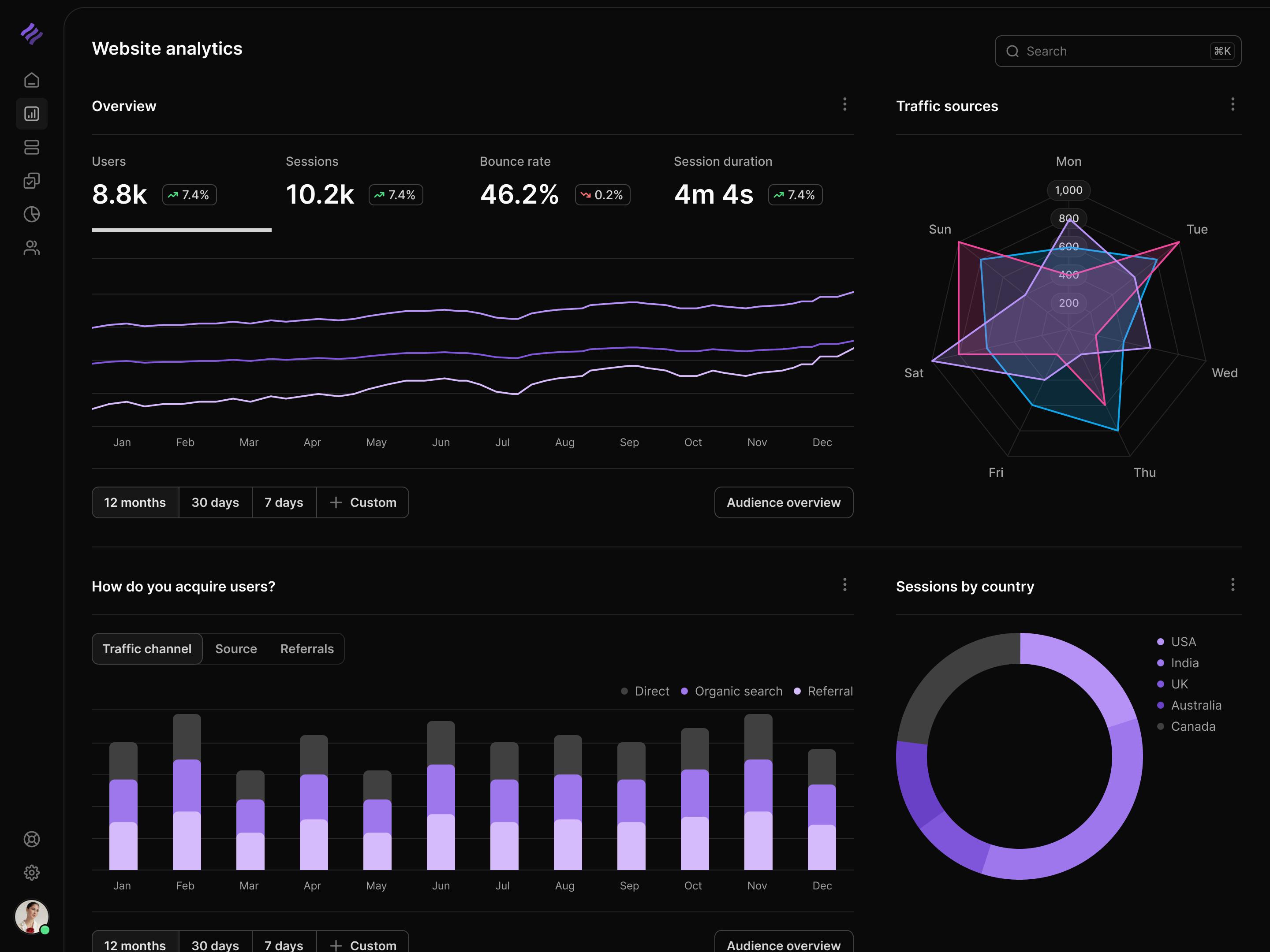
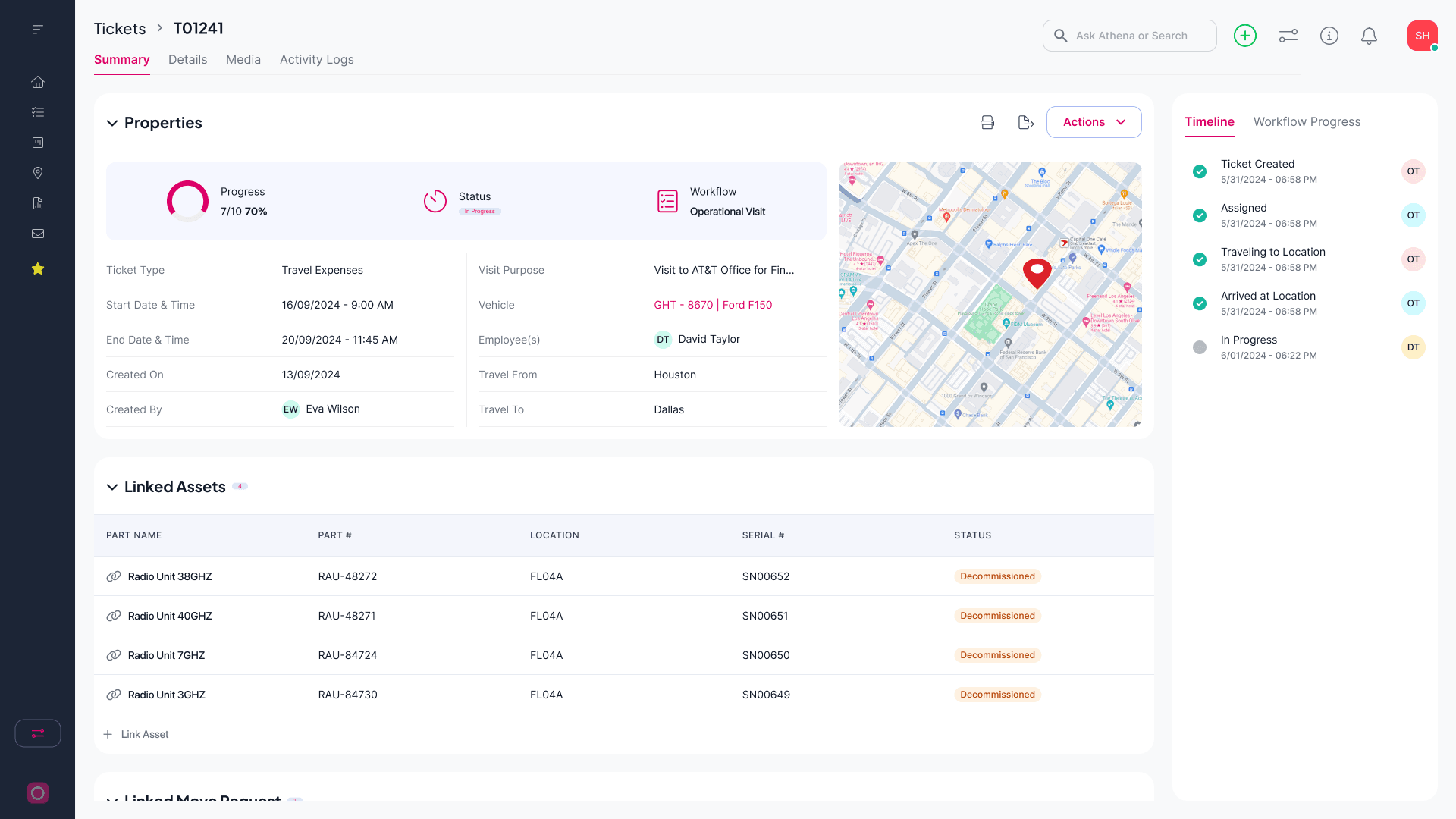
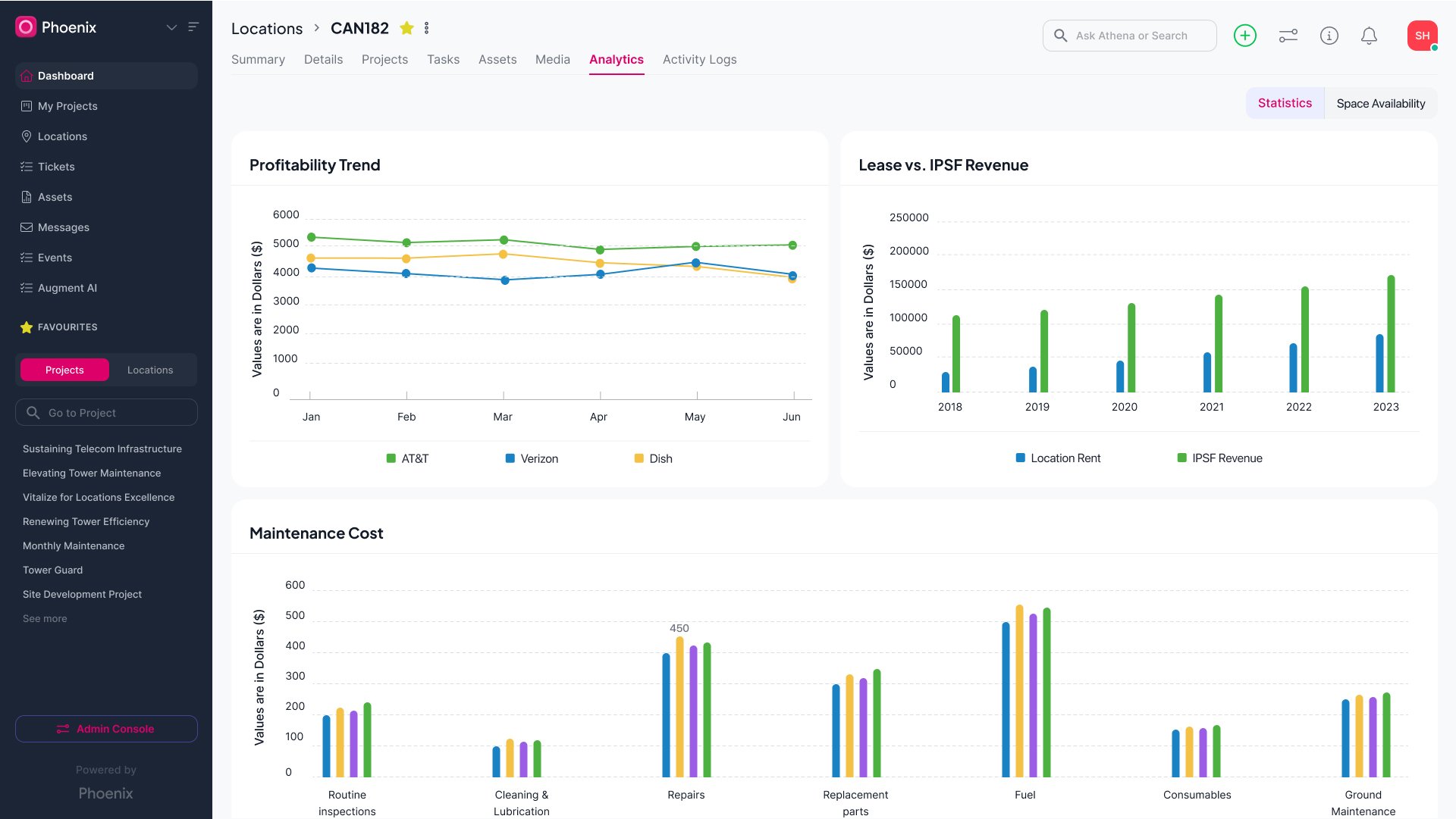
The ticket dashboard brings properties, location, linked assets, and activity onto one screen. Analytics separates profitability, revenue, and maintenance cost into charts, giving teams a way to review performance alongside the underlying work.
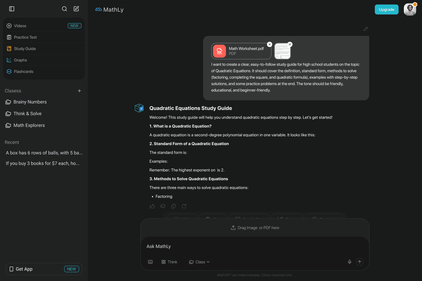
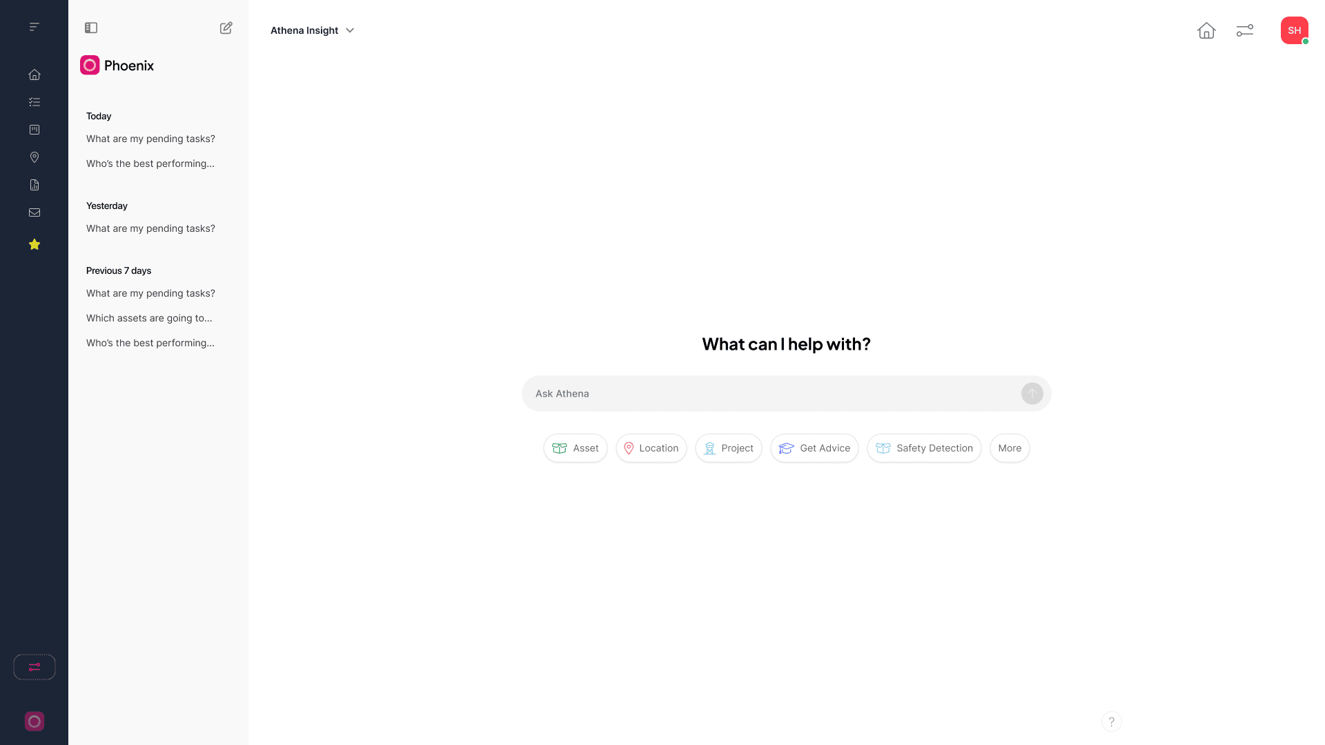
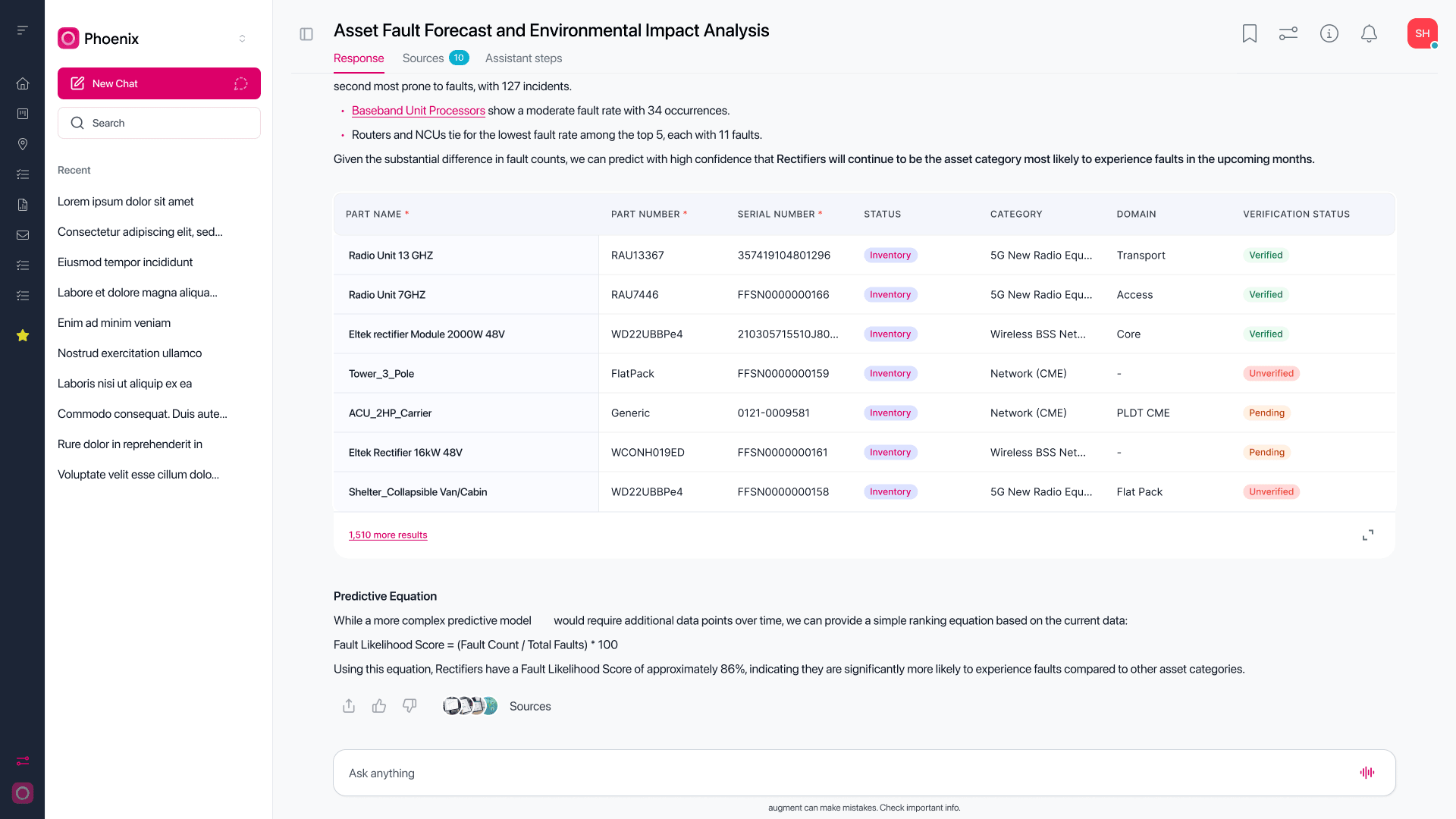
The AI workspace offers a simple conversation entry point. The analysis example expands into an asset fault forecast with a structured table and explanatory notes, keeping a detailed response inside the conversation.
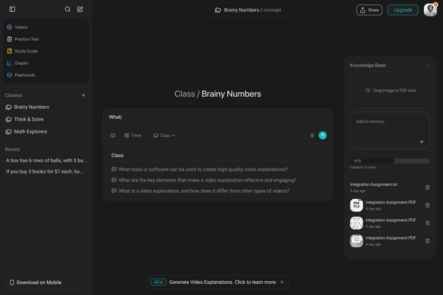
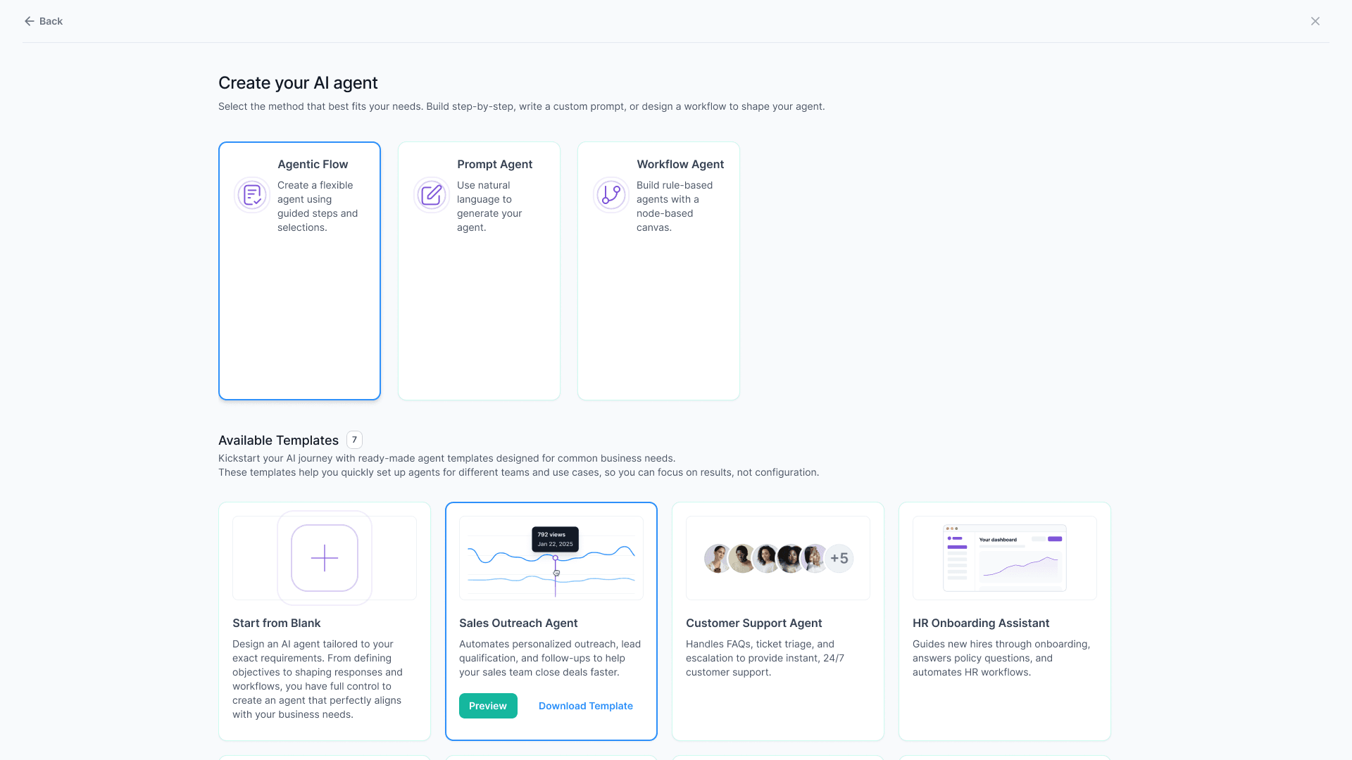
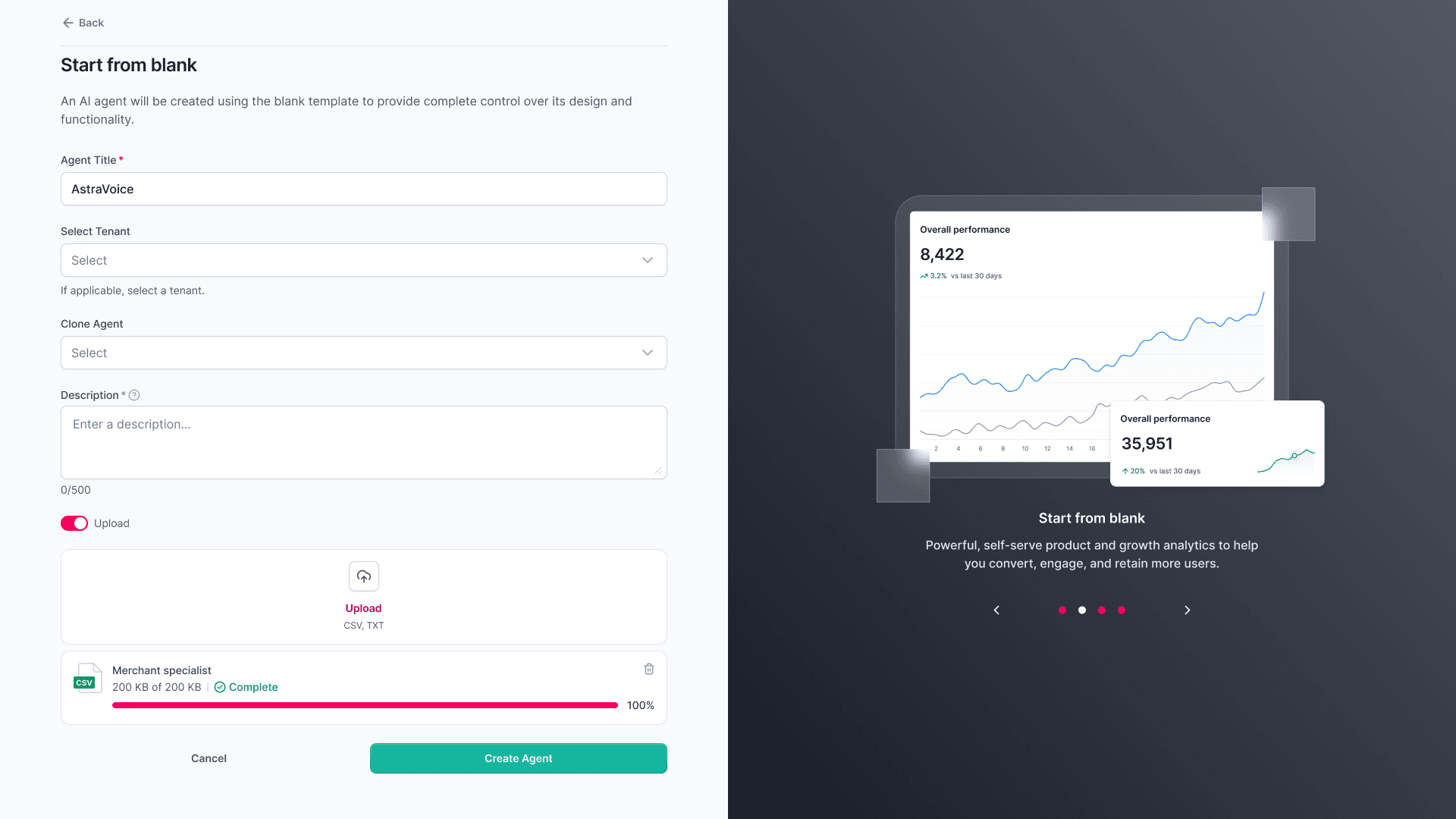
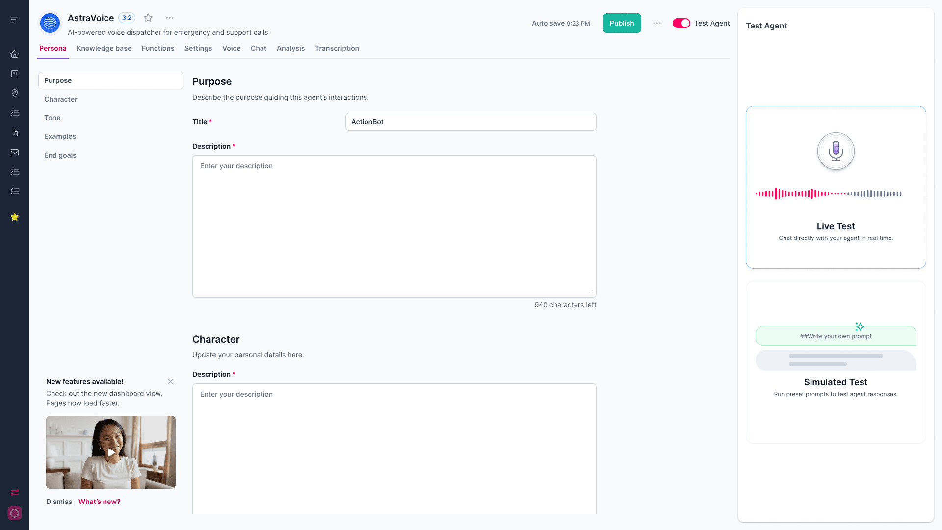
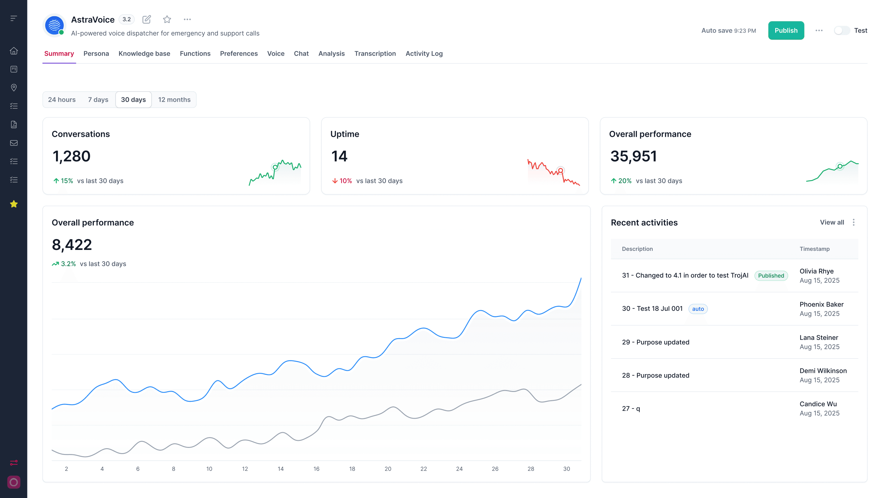
Users can select an agent type or begin with a template. The blank setup collects the basics, while the configuration view brings purpose, character, and testing into one workspace. The summary screen presents usage and activity after setup.
Settings gathers profile, workspace, and agent options into a persistent side navigation. Grouped controls and a visible save action make it clear where configuration changes belong.

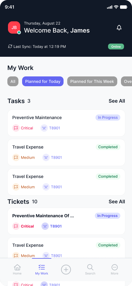
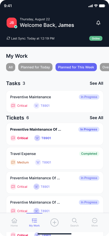
The mobile experience starts with a simple launch screen and a My Work overview. Filters for all work, today, and the current week narrow the same task and ticket lists to the time frame a field worker needs.

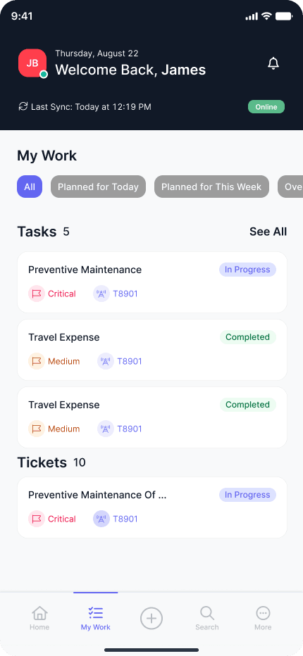
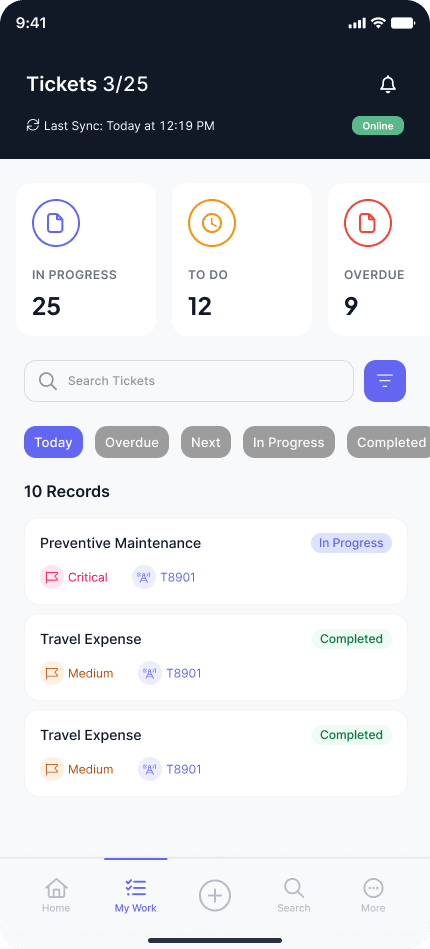
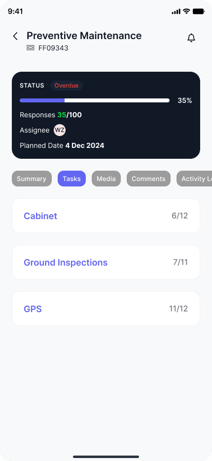
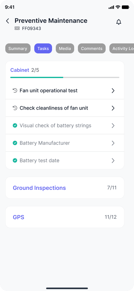
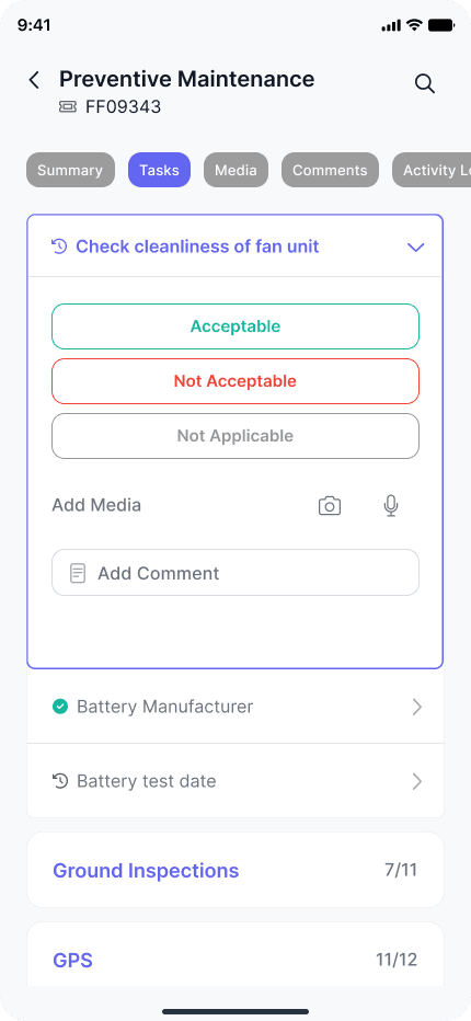
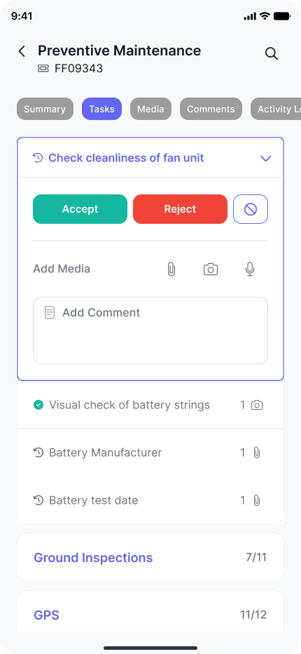
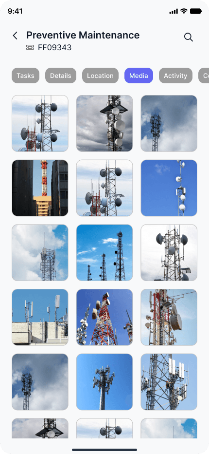
The ticket list combines status counts, search, and filters. Inside a ticket, progress and section counts lead into individual inspection questions. Expanded sections expose answer choices, comments, and media controls without leaving the ticket.
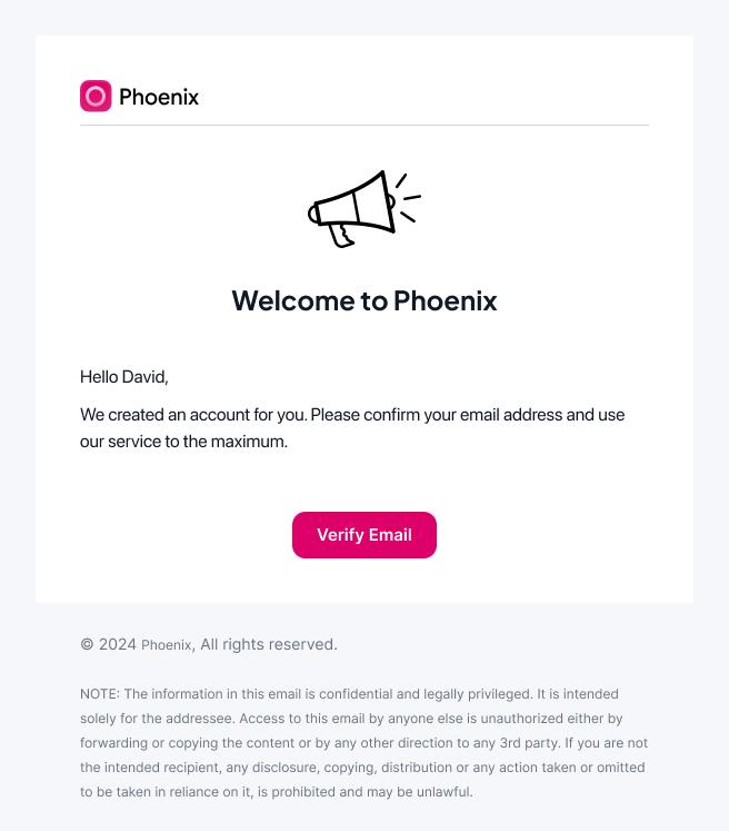
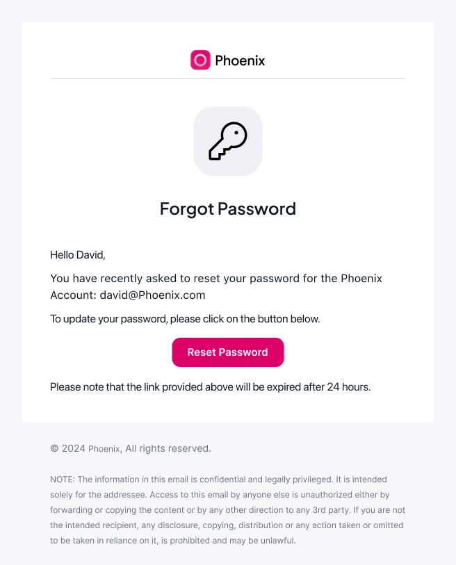
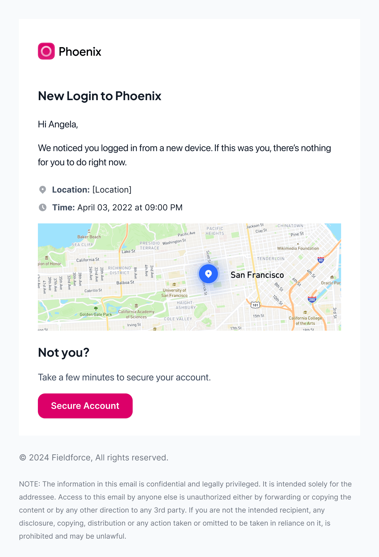
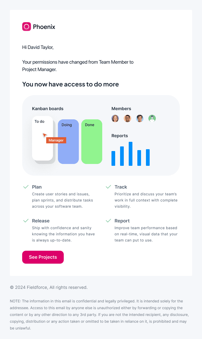
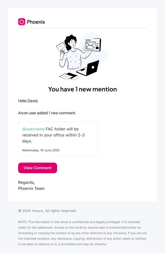
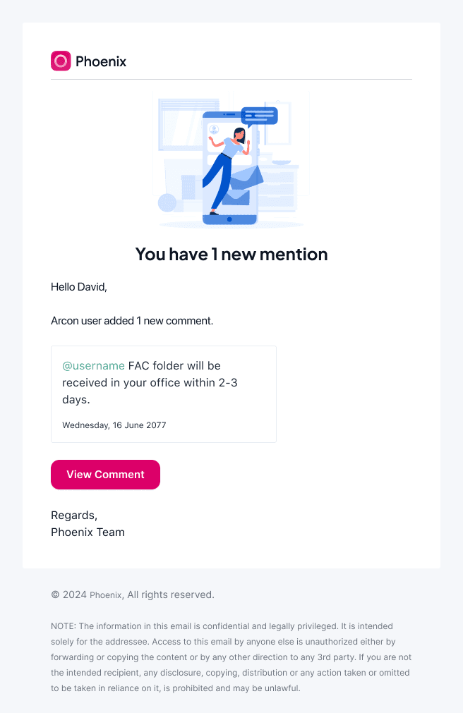
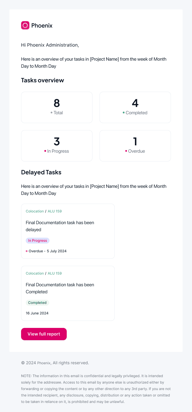
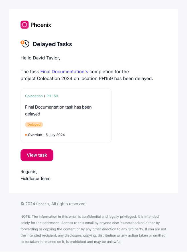
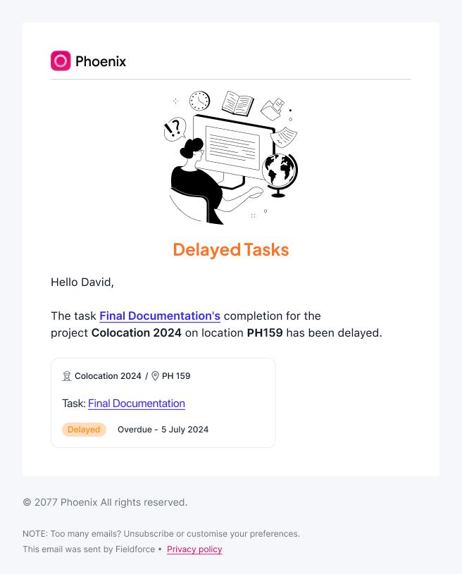
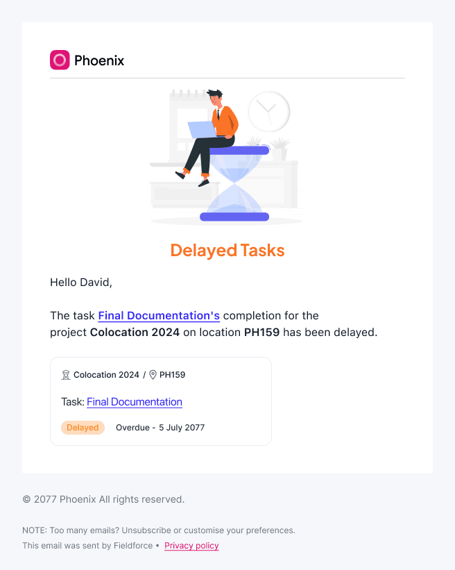
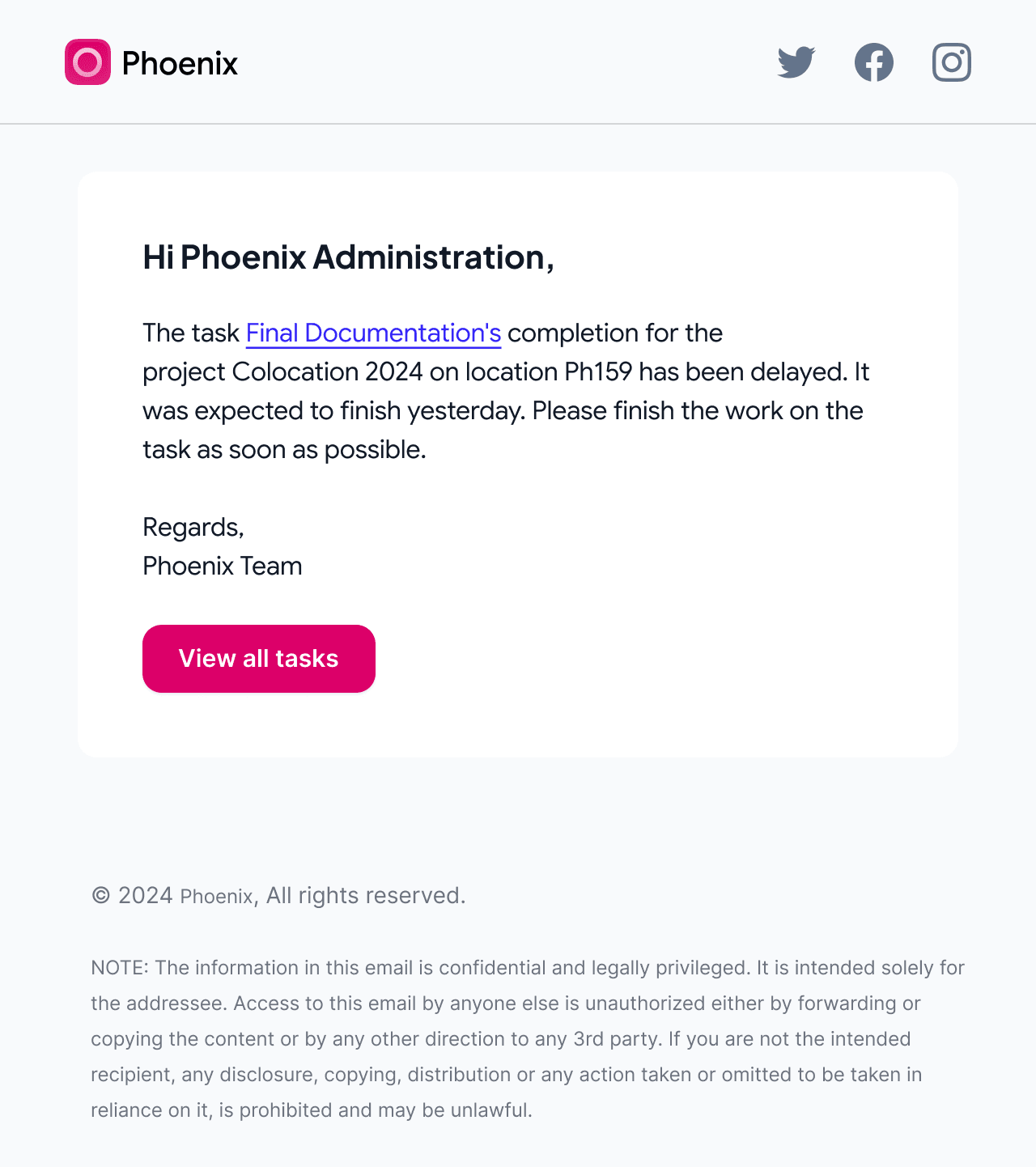
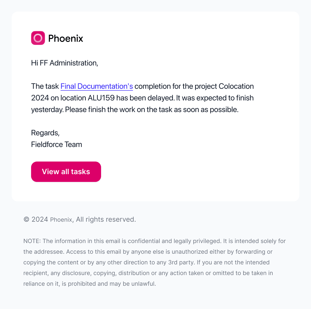
Account setup, security alerts, mentions, and task updates share one set of email components: the same logo lockup, type scale, status cards, buttons, and footer, arranged for each message.
Phoenix now tells one story, from the first pitch to a field crew closing a ticket. Buyers get it faster, and users move through deployment and asset work without relearning the interface on every screen.
The design system is the part that keeps paying off. New modules, use cases, and sales decks all start from patterns that already exist, on a platform that publicly reports more than $10 billion in managed assets.
“Augment has been an exceptional design partner. They take complex enterprise workflows and turn them into experiences that feel clear, intuitive, and genuinely easy to use: a stronger identity, a more consistent product, and a scalable design foundation across our website, platform, and mobile apps.”
Asset figure is drawn from Phoenix’s published website.
Visit PhoenixHave a product that has outgrown its design?
Show us the platform and where users get lost. We'll help you find the right place to start.